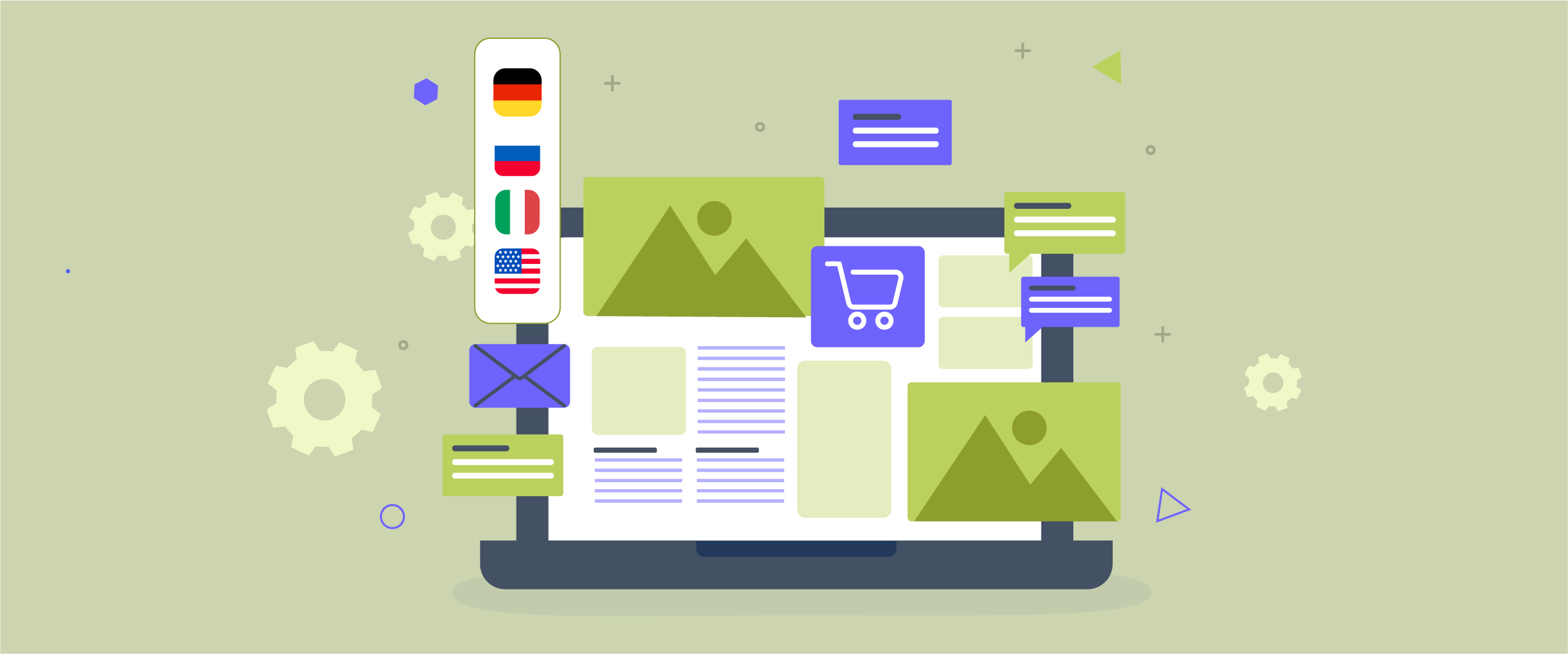
Multilingual UX microcopy is often overlooked in digital products, yet it strongly influences how users interact with forms, error messages, and checkout flows. Short text prompts that guide users through key actions can be mistranslated or unclear, creating friction that leads to confusion, hesitation, and cart abandonment, especially on multilingual e-commerce and SaaS platforms.
This article explores how multilingual UX microcopy can drive conversions rather than merely serve as translated text. From core principles to practical best practices, this guide helps uncover minor copy issues that quietly cause major revenue leaks. Read until the end to learn how refining multilingual microcopy can significantly improve user confidence and conversion rates.
Keypoints: Multilingual UX microcopy strategies
Precise form guidance
Localize labels and placeholders to clearly guide users per language, reducing confusion and drop-offs.
Helpful error messaging
Rewrite errors to politely explain issues and fixes, matching cultural politeness levels.
Trust-building checkout
Adapt payment CTAs, policies, and instructions for local reassurance and higher conversions.
What is UX microcopy?

UX microcopy refers to the small pieces of text within an interface that guide users as they interact with a product. This includes form labels, placeholder text, error messages, helper text, tooltips, and confirmation messages. Although these texts are short, they play an essential role in helping users understand the next steps, what went wrong, and how to complete an action without confusion.
Good UX microcopy works quietly in the background. It reassures users, sets clear expectations, and reduces friction at key moments, such as form completion or checkout. Instead of sounding technical or robotic, effective microcopy feels human and supportive, using simple language that matches the user’s context and intent.
In a multilingual context, UX microcopy becomes even more important. Direct or literal translations often fail to capture tone, clarity, or cultural meaning, which can confuse users rather than help them. Well-designed multilingual UX microcopy focuses on meaning and user intent, ensuring that each language version feels natural and guides users smoothly through the experience.
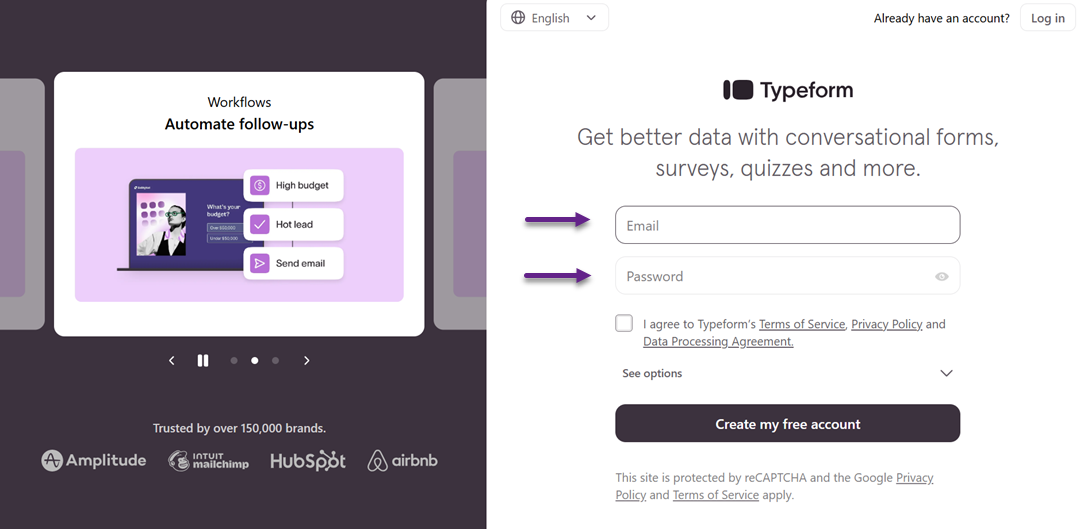
Forms and input fields

Forms and input fields are one of the most sensitive areas in user experience. They require users to provide information, make decisions, and trust the system with their data. In a multilingual interface, even minor wording issues in form microcopy can slow users down, cause errors, or make them abandon the process entirely.
Label and placeholder text
Labels and placeholder text help users understand what information is required in each field. Clear labels reduce guesswork, while well-written placeholders give quick examples or context without overwhelming the user. When translated poorly, labels can become vague or misleading, leading users to enter incorrect data or hesitate before continuing.
In multilingual products, labels should prioritize clarity over literal translation. A phrase that works well in one language may sound unnatural or too long in another. Adjusting word choice and sentence structure ensures that labels remain concise and easy to scan, which is especially important on mobile screens.
Placeholders should support labels, not replace them. In different languages, placeholders may require cultural or format adjustments, such as date, phone number, or address examples. Thoughtful localization here helps users feel confident and reduces unnecessary form errors.
Error messages and validation
Error messages appear at moments of frustration, making their wording especially important. A good error message clearly explains what went wrong and what the user needs to do next. In multilingual environments, unclear or overly technical translations can make users feel stuck or blamed for the mistake.
Effective multilingual error messages use simple, polite language and avoid ambiguity. Instead of translating messages word for word, focus on intent—guiding users to a solution as quickly as possible. This helps maintain trust and keeps users moving forward rather than abandoning the form.
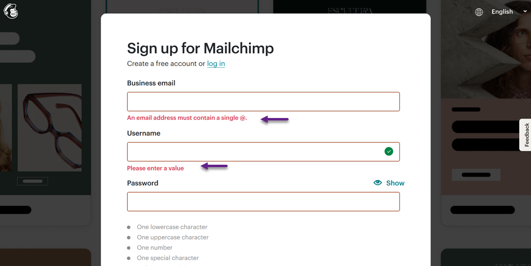
Validation messages should also be consistent across languages, as shown below in Spanish.
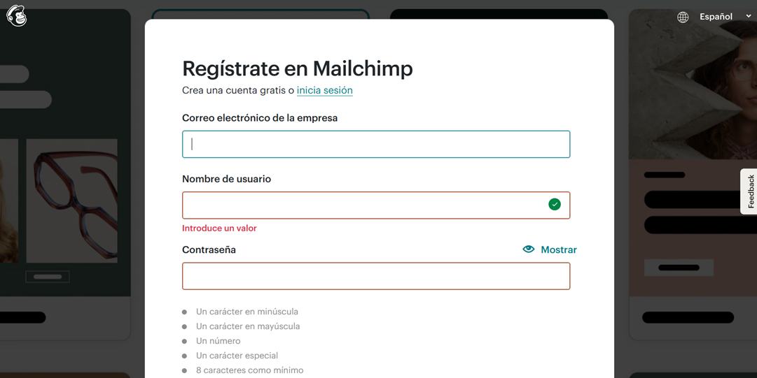
If one language sounds helpful while another feels harsh or confusing, the overall experience becomes uneven. Aligning tone and clarity across all language versions ensures a smoother and more inclusive user journey.
Hints, tooltips, and help text
Hints, tooltips, and help text provide extra guidance without cluttering the interface. They are handy for complex inputs, such as passwords, shipping details, or payment information. In multilingual UX, these elements help prevent errors before they happen.
When localized properly, help text explains concepts in a way that feels natural to each audience. Some instructions may need to be rephrased or expanded to account for cultural expectations or common user behavior across regions. This is more effective than relying on direct translations that may feel awkward or unclear.
Well-crafted multilingual hints and tooltips build user confidence. They reassure users that they are entering the right information and reduce the need for trial and error. As a result, forms feel easier to complete, leading to higher completion rates and fewer drop-offs.
Checkout and conversion copy

The checkout stage is where users make final decisions. At this point, UX microcopy must be clear, reassuring, and action-oriented—especially in multilingual experiences, where small misunderstandings can quickly lead to hesitation or cart abandonment.
Payment instructions and confirmation messages
Payment instructions guide users through one of the most sensitive steps in the user journey. Clear multilingual copy helps users understand payment methods, required steps, and what will happen after they click the final button. Poor translations or unclear phrasing can raise doubts about whether a payment is secure or has been successfully processed.
Confirmation messages are equally important. Users need immediate reassurance that their payment went through and their order is complete. In a multilingual context, these messages should feel confident and natural, clearly stating what happens next, such as order tracking or email confirmation, to reduce anxiety and build trust.
Promotional text and CTAs
Promotional text and calls to action (CTAs) are designed to persuade users to move forward. In multilingual UX, direct translations often weaken urgency or sound unnatural, reducing their effectiveness. A CTA that converts well in one language may feel too aggressive or too passive in another.
Effective multilingual CTAs focus on intent rather than exact wording. Adjusting tone, verb choice, and sentence structure helps maintain persuasion while respecting cultural differences. When done well, localized promotional copy feels motivating and relevant, encouraging users to complete their purchase.
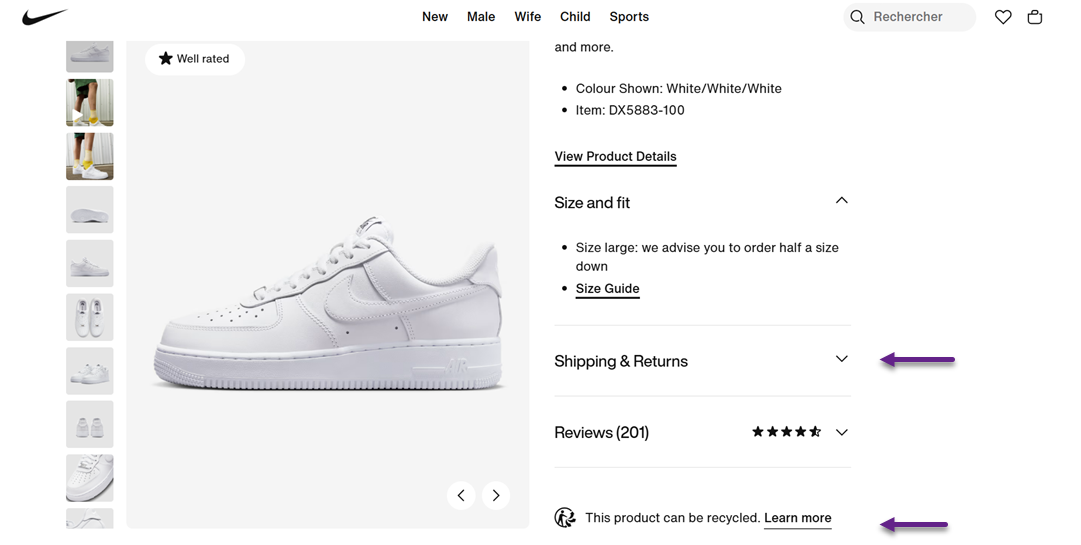
Shipping, returns, and policy messages
Shipping, returns, and policy messages directly influence user confidence during checkout. Users want clear answers about delivery times, costs, and return conditions before committing to a purchase. Inconsistent or unclear translations in these areas can quickly raise doubts and stop conversions.
Well-localized policy messages prioritize clarity and transparency. Instead of copying legal-style language across languages, effective multilingual microcopy explains policies simply and reassuringly. This helps users feel informed and protected, making them more comfortable completing the checkout process.
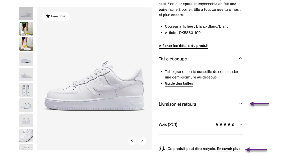
Here are examples of UX microcopy that display shipping and return information, as well as product recycling information.
When translated into French, both pieces of UX microcopy were well translated and localized.
Best practices for multilingual microcopy
Creating effective multilingual UX microcopy requires more than accurate translation. It involves consistency, collaboration, and continuous improvement to ensure that short text remains clear, natural, and conversion-focused across all languages and user touchpoints.
Consistency and style guides
Consistency ensures that users encounter familiar terms, tone, and phrasing throughout the product. In multilingual environments, this means using the same translated terms for buttons, form labels, and system messages across all screens. Inconsistent wording can confuse users and make the interface feel unreliable.
A multilingual style guide helps maintain this consistency. It defines the tone of voice, preferred terminology, levels of formality, and examples for each language. With a clear guide, teams can avoid fragmented translations and deliver a cohesive user experience that feels intentional and professional.
Testing and optimization
Multilingual microcopy should be tested just like any other UX element. What sounds clear in theory may still confuse real users, especially when cultural expectations differ. Usability testing with native speakers helps reveal unclear wording, awkward phrasing, or misunderstood instructions.
Optimization should be ongoing. A/B testing different versions of microcopy—such as CTAs or error messages—can uncover which phrasing performs better in each language. Minor adjustments over time can lead to significant improvements in conversion and user satisfaction.
Collaboration between teams
Strong multilingual microcopy is the result of collaboration, not isolated work. UX writers, designers, developers, and translators all contribute to how microcopy appears and functions in the interface. When these teams work separately, important context is often lost.
Early and continuous collaboration ensures that translations align with design constraints, user flows, and technical limitations. This shared understanding reduces rework and results in microcopy that feels seamless, accurate, and user-centered across languages.
Localization with context
Localization works best when translators understand where and how microcopy is used. Without context, short texts like buttons or error messages can be easily misinterpreted. Providing screenshots, user flows, or usage notes helps translators capture the intended meaning.
Context-driven localization focuses on purpose rather than literal wording. This allows microcopy to be adapted naturally for each language while still supporting the same user goal. The result is a copy that feels intuitive and supportive, not forced or mechanical.
Continuous review based on user behavior
User behavior provides valuable insight into how well multilingual microcopy performs. High drop-off rates, repeated errors, or abandoned checkouts often point to unclear or misleading copy in specific languages.
Regularly reviewing analytics, support tickets, and user feedback helps teams identify problem areas. By refining microcopy based on real behavior, products can continuously improve clarity, reduce friction, and deliver a more effective multilingual user experience.
Conclusion
Multilingual UX microcopy plays a crucial role in shaping how users experience forms, error messages, and checkout flows across different languages. As shown throughout this guide, small pieces of text—when unclear, inconsistent, or poorly localized—can create friction that leads to confusion, loss of trust, and cart abandonment.
Ultimately, effective multilingual UX microcopy is not a one-time task but an ongoing process that combines consistency, testing, collaboration, and behavior-driven refinement. When done right, it builds confidence, reduces errors, and helps users move forward with ease—regardless of language. If you want to simplify this process and ensure your microcopy stays accurate, contextual, and conversion-focused across languages, try Linguise and see how smarter localization can transform your user experience.