
Translated websites break layouts more often than many website owners expect. A website that looks perfectly organized in English can suddenly have overflowing buttons, wrapped navigation menus, or misaligned content after translation. As a result, what should be a seamless multilingual experience can quickly become frustrating for users.
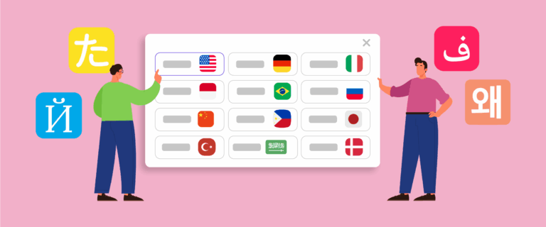
The main cause is text expansion, in which translated content occupies more space than the original English text. Because many websites are designed around English-length content, they often struggle to accommodate longer translations. In this article, you’ll learn why text expansion causes layout issues, how expansion rates vary across languages, and how to design websites that remain visually consistent from the start.
Key points: How to design websites that handle text expansion across languages
Text expansion is the main cause of layout breakage
Translated content often requires 15–35% more space than English, causing navigation menus, buttons, forms, and other interface elements to overflow, wrap, or become misaligned.
Different languages create different layout risks
Languages such as German, French, Spanish, and Finnish can expand significantly compared to English, making multilingual websites more vulnerable to layout issues if text growth is not considered during design.
Flexible design prevents translation-related issues
Using flexible containers, scalable buttons, responsive typography, and adaptive layouts helps websites accommodate text expansion and maintain a consistent user experience across all languages.
Why translated websites break layouts due to text expansion

Most websites are designed around English-length content, which works well until the site is translated into languages that require more space. For example, German text can be approximately 35% longer than its English equivalent, while Finnish may require even more expansion depending on the context. Without accounting for this growth, design elements that appear perfectly aligned in English can quickly overflow, wrap unexpectedly, or break the layout after translation.
Some of the most common reasons text expansion causes layout breakage include:
- Most websites are designed for English-length content: English is relatively concise compared to many other languages. Designs optimized for English text may not leave enough room for longer translations.
- Different languages require different amounts of space: The same message can become significantly longer when translated into languages such as German, French, or Finnish, making fixed-size design elements more vulnerable to breakage.
- Buttons and navigation menus have limited space: When translated labels exceed the available width, text may wrap onto multiple lines, become truncated, or push surrounding elements out of alignment.
- Fixed-width containers cannot adapt to longer text: Content blocks with strict width limitations often struggle to accommodate expanded text, resulting in overlapping or overflowing content.
- Mobile layouts are more sensitive to text expansion: Smaller screens provide less space for translated content, increasing the likelihood of wrapping, clipping, and other layout issues.
Text expansion rates across languages: a reference guide
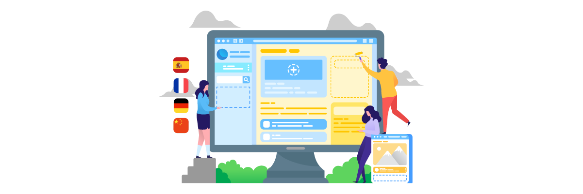
Text expansion varies significantly across languages, which is why some translated websites experience more layout issues than others. While English is often used as the source language, translations may require considerably more or less space depending on the target language. Understanding these differences can help website owners identify potential layout risks before launching a multilingual website.
The table below summarizes typical text expansion rates by language family. These percentages are estimates and may vary depending on content type, industry terminology, and writing style, but they provide a useful benchmark when planning translation-ready layouts.
Language Family | Language | Typical Expansion from English |
Germanic | German | +10% to +35% |
Germanic | Dutch | +10% to +15% |
Germanic | Danish | -10% to -15% |
Germanic | Norwegian | -5% to -10% |
Germanic | Swedish | -10% |
Romance | French | +15% to +20% |
Romance | Spanish | +15% to +30% |
Romance | Italian | +10% to +25% |
Romance | Portuguese | +15% to +30% |
Romance | Catalan | +15% |
Slavic | Russian | +15% |
Slavic | Polish | +20% to +30% |
Slavic | Czech | +10% |
Slavic | Croatian | +15% |
East Asian | Japanese | -10% to -55% |
East Asian | Chinese (Simplified) | -30% |
East Asian | Korean | -10% to -15% |
Uralic | Finnish | -25% to -30% |
Uralic | Estonian | +15% |
Semitic | Arabic | +20% to +25% |
Semitic | Hebrew | -20% to -30% |
Indo-Aryan | Hindi | +15% to +35% |
Southeast Asian | Thai | +15% |
Southeast Asian | Burmese | +15% |
A positive percentage indicates that translated text typically requires more space than English, while a negative percentage indicates that it may require less space. For example, German content can be up to 35% longer than English content, whereas Japanese content may use significantly fewer characters. When designing multilingual websites, it is generally safest to plan for the upper end of the expansion range to reduce the risk of layout breakage after translation.
Before-and-after website audit checklist for text expansion risks

Before translation, most websites are designed and tested using English-length content. This creates layouts that look clean and balanced, with buttons, menus, and sections sized perfectly for short English text. However, after translation, text expansion can increase content length by 15–35% or more, which often leads to overflow, wrapping, or broken alignment. This section helps identify which parts of an existing website are vulnerable to these issues before they happen.
Navigation menus
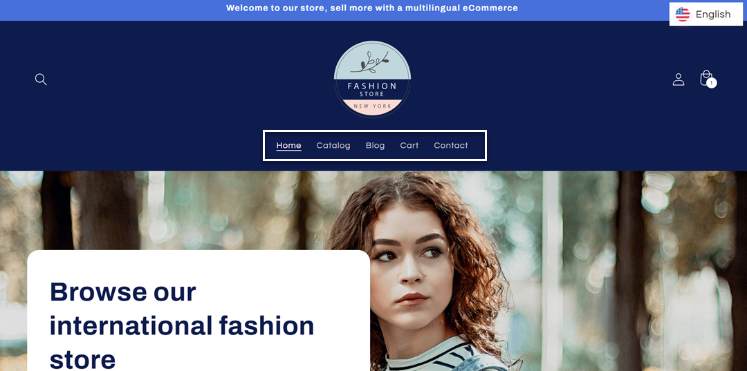
Navigation menus are typically designed with short English labels such as “Home,” “About,” or “Services,” which fit comfortably in a single horizontal row in the default layout. These elements are usually tested primarily in English, so the design assumes minimal text length and consistent spacing across all menu items.
The following example shows a navigation menu in English where the labels fit neatly within a single horizontal bar.
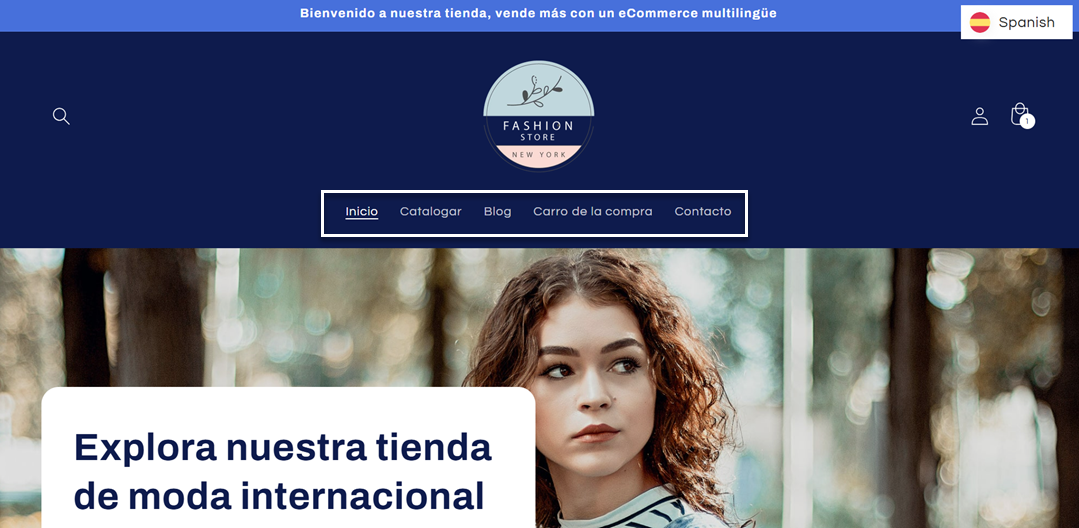
However, after translation into Spanish, several navigation items become significantly longer—for example, “Home” becomes “Inicio” and “Cart” becomes “Carro de la compra.” This increase in text length can affect spacing and may cause the menu to wrap or shift, depending on the available screen width.
As shown in the example image, this text expansion causes menu items to wrap onto multiple lines, disrupting the horizontal layout, especially when the navigation is built with fixed spacing and limited flexibility.
Checklist:
- Does the navigation still fit in one row after text expands by ~20–35%?
- Do menu items wrap or overflow horizontally?
- Is the spacing between items still consistent after expansion?
- Does the mobile navigation remain readable and usable with longer labels?
Buttons and CTAs
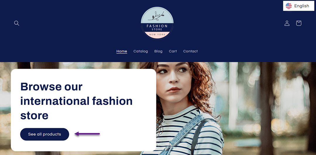
Buttons and CTAs are usually optimized for short, action-driven English phrases such as “See All Products,” which fit neatly inside fixed-width or padding-based button designs in the before state.
Below is how the button looks in its English version, where the layout remains compact and visually balanced due to the shorter text length.
After translation, these phrases often become longer, for example, “See All Product” can expand in languages like German into “Alle Produkte anzeigen”, causing text to wrap into multiple lines or exceed the button’s original width. Below is how the same button looks after being translated into German, where the button expands horizontally because the translated text is significantly longer.
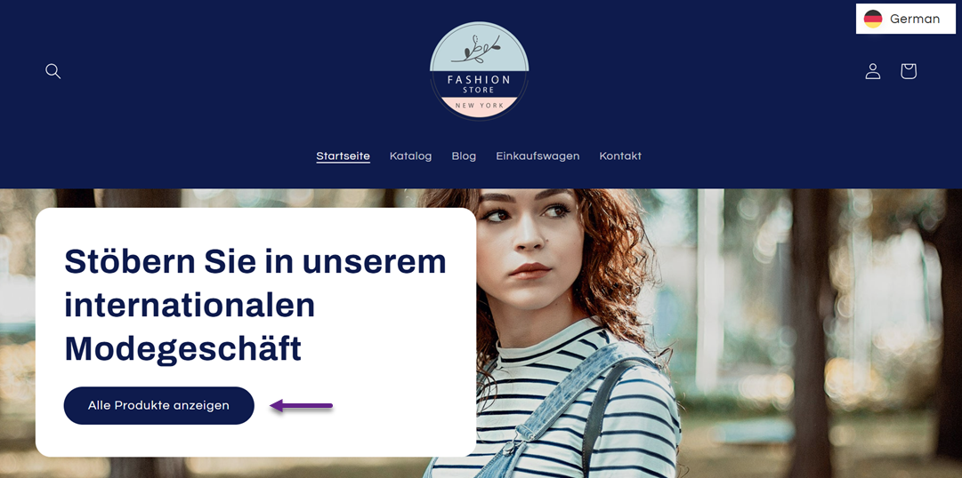
This leads to inconsistent button heights and visual imbalance across sections, especially on landing pages with multiple CTAs. The main reason this happens is that buttons are often designed with fixed dimensions or limited padding rules, assuming English-length text will always fit.
Checklist:
- Does button text remain on one line after translation?
- Do all buttons maintain consistent height across the page?
- Does text wrapping still look visually balanced and readable?
- Are CTA groups still properly aligned after the expansion?
Forms and field labels
Forms and field labels are usually designed with very short English labels such as “Name,” “Email,” or “Phone Number,” so they align cleanly with input fields in the before state.
After translation, these labels often become significantly longer for example, “Phone Number” may expand into longer phrases in German or French, causing labels to wrap onto multiple lines or misalign with their input fields. This breaks visual hierarchy and reduces scanability, especially in longer forms.
This issue occurs because form layouts often rely on tight alignment rules between labels and inputs, without accounting for variability in text length across languages.
Checklist:
- Do labels remain aligned with input fields after text expansion?
- Do labels avoid unnecessary line breaks?
- Is the form still easy to scan and complete quickly?
- Does spacing remain consistent across all form fields?
Cards, tables, and pricing sections
Cards, tables, and pricing sections are designed in the before state with balanced text lengths, allowing equal heights and consistent grid alignment across components.
After translation, content within cards or pricing columns can expand unevenly—for example, product descriptions or feature lists may become 20–30% longer in languages like French or Spanish. This causes some cards to grow taller than others, breaking grid alignment and making comparisons harder to scan.
This happens because these layouts often assume uniform content length, but text expansion introduces unpredictable variation across languages.
Checklist:
- Do all cards maintain equal height after translation?
- Does the grid remain aligned without vertical mismatch?
- Are pricing columns still visually balanced?
- Is content still easy to compare across cards or tables?
Mobile layouts
Mobile layouts are already constrained in the before state, with limited screen width and carefully optimized spacing for English-length text.
After translation, text expansion has a much stronger impact, for example, German or Polish text may become significantly longer, causing overflow, excessive line wrapping, or elements being pushed outside the viewport. This can make buttons harder to tap and content harder to read.
This happens because mobile layouts have limited horizontal space, so even small increases in text length can disrupt the overall visual flow.
Checklist:
- Is there any horizontal overflow after text expansion?
- Do all elements stay within the mobile viewport?
- Are buttons still easy to tap and visually balanced?
- Does vertical spacing remain readable and structured?
How to design websites for text expansion from the start

Designing a website for multilingual use involves anticipating how text will behave once it becomes longer or shorter in different languages. Most layout issues happen because websites are originally built for English-length content, which does not account for text expansion in languages like German or Finnish. By designing with flexibility from the beginning, you can prevent layout breakage before it happens and ensure your website remains stable across all languages.
Use flexible containers
Instead of designing layouts with fixed widths, websites should be built with flexible containers that adapt to varying text lengths. In practice, this means your layout should be able to expand or contract based on the amount of text it contains, rather than forcing content into a rigid structure that only fits English-length labels.
From a website owner’s perspective, this is something you should clearly communicate to your developer. Ask your developer to use flexible containers instead of fixed-width elements, so sections like navigation, cards, and headers can naturally adjust when text expands in translation. This is especially important for languages like German or Polish, where text can become significantly longer than in English.
Without flexible containers, even small text expansion can break alignment, cause overflow, or force unwanted line breaks. With a flexible design, the layout absorbs these changes naturally without breaking the visual structure.
Design scalable buttons
Buttons are among the most common elements affected by text expansion because they often rely on fixed sizes and short English phrases. In a multilingual context, button text can easily become 20–35% longer, leading to wrapping, uneven button heights, or misaligned CTAs.
As a website owner, you should request buttons that can accommodate longer translated text without breaking the design. This means asking your developer to avoid fixed-width buttons and instead use scalable button components that can grow horizontally or vertically when needed. Buttons should be able to handle longer phrases, such as German or French translations, without forcing text to shrink or wrap awkwardly.
Scalable buttons ensure that all CTAs remain consistent across languages, maintaining both readability and visual hierarchy. This is especially important for landing pages where button consistency directly affects user experience and conversion flow.
Avoid minimum-width restrictions
Minimum-width restrictions are one of the hidden causes of layout breakage in multilingual websites. Many designs set a minimum width for elements such as cards, buttons, and navigation items to maintain visual consistency in English. However, once text is translated and becomes longer, these constraints can prevent elements from expanding naturally.
From a website owner’s perspective, you should ask your developer to avoid rigid minimum-width rules for text-based components. Instead, layout elements should be allowed to expand based on content length, especially for dynamic text like navigation labels, product names, or form fields. This becomes critical when dealing with languages like Finnish or Spanish, where text expansion can exceed 30%.
By removing strict minimum-width constraints, you allow the design to adapt naturally to different languages, reducing the risk of overflow, broken alignment, or clipped text. This creates a more resilient layout that works across all translations without requiring redesign for each language.
Use responsive typography
Typography plays a significant role in how translated content is displayed across different languages. While flexible containers help accommodate longer text, poor typography settings can still create readability and layout issues. Languages such as German, Finnish, and Spanish often produce longer words and phrases than English, which can make text appear crowded if font sizes, line heights, and spacing are not properly configured.
From a website owner’s perspective, you should encourage your designer and developer to implement responsive typography that adapts across different screen sizes and languages. This includes using appropriate line height, sufficient spacing between elements, and scalable font sizes that remain readable when content expands. Avoid tightly packed text layouts that leave little room for translation growth.
Responsive typography improves both readability and visual balance, ensuring that translated content remains easy to scan without disrupting the overall design. By treating typography as a flexible component rather than a fixed design element, websites can better accommodate text expansion while maintaining a consistent user experience across languages.
Conclusion
Translated websites break layouts mainly because most designs are built for English-length content, while many languages expand significantly during translation. As a result, elements like menus, buttons, and forms can overflow or misalign when text becomes longer in languages such as German, French, or Finnish.
To avoid these issues, websites need to be designed with flexibility from the start, using scalable components and adaptive layouts. If you want a simpler way to handle multilingual websites without worrying about text expansion, you can use Linguise, a translation solution that helps maintain layout consistency across languages while supporting text expansion naturally.