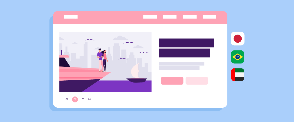
A hero image that performs well in one country may fail in another. A minimalist design that feels modern in Western markets can appear incomplete in Japan, while individual-focused visuals may struggle to create an emotional connection in Brazil. In the Middle East, even image composition and CTA placement can affect how users interact with a page due to right-to-left reading behavior.
In this article, we will explore how cultural psychology influences conversion rates in Japan, Brazil, and the Middle East, along with practical strategies to localize hero images more effectively.
Key points: The hidden reason hero images fail to convert across regions
Cultural differences affect hero image conversions
Hero images that work in one country may fail in another because audiences respond differently to visuals, layout, and emotional tone.
Translation alone is not enough
Successful localization requires adapting visuals, messaging, layout, and user experience, not just translating headlines into another language.
Localized testing improves performance
Testing different hero image variations across markets helps businesses identify which visuals, messaging, and layouts drive higher engagement and conversions.
Why global hero images fail to convert across cultures

Many businesses assume that translating website text is enough to localize the user experience. However, hero images also communicate cultural signals that influence trust, attention, and conversion behavior. A visual that feels persuasive in one region can appear confusing, emotionally distant, or even uncomfortable in another market.
- Visual trust signals differ across cultures: Some audiences trust clean and minimalist layouts, while others prefer information-rich visuals that feel more detailed and credible.
- Reading behavior changes how users scan a page: Left-to-right and right-to-left reading patterns affect where users focus first, how they process visual hierarchy, and which CTA placements feel natural.
- Human imagery creates different emotional responses: Individual-focused visuals may work well in some markets, but communal and expressive imagery often performs better in cultures that value social connection.
- Colors carry different cultural meanings: The same color palette can convey trust, energy, luxury, or discomfort depending on the region and cultural context.
- First impressions shape conversion decisions quickly: Users often form opinions about credibility and relevance within seconds of landing on a page, making hero images one of the most influential visual elements.
- Cultural expectations influence engagement behavior: A hero section that feels modern and persuasive in one country may appear emotionally distant, visually confusing, or less trustworthy in another.
- Global design consistency can reduce local relevance: Using a single universal hero image across all markets may simplify branding, but it can also weaken emotional connection and reduce conversion potential.
Hero image localization in Japan
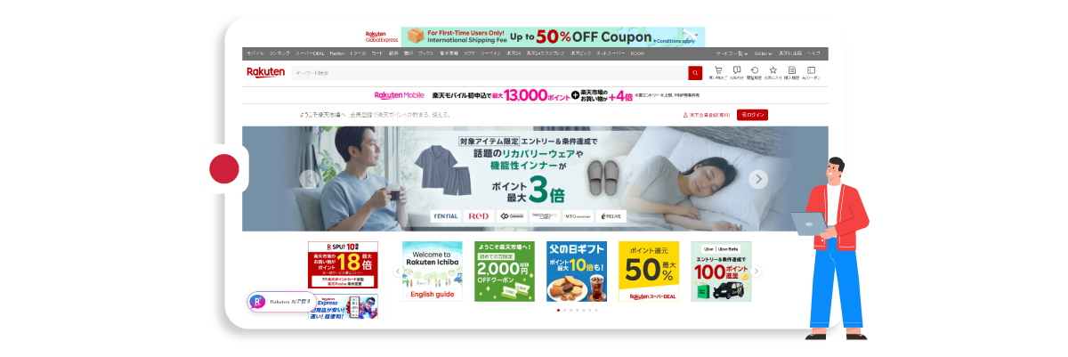
Japanese audiences often associate credibility with informative and structured website layouts. While minimalist hero sections are popular in many Western markets, designs with too much empty space can sometimes feel incomplete or less trustworthy in Japan. Because of this, hero image localization in Japan should focus on balancing clarity, detail, and visual structure.
Add more supporting details
Hero sections in Japan often perform better when they include additional supporting elements such as short descriptions, product highlights, certifications, statistics, promotional banners, or trust indicators. These details help users quickly evaluate legitimacy and reduce uncertainty before exploring the rest of the website.
For example, Japanese ecommerce websites like Rakuten often combine promotional banners, navigation shortcuts, loyalty information, and product-related details directly within the hero area. This structured and information-rich approach helps create a stronger sense of trust and clarity for users.
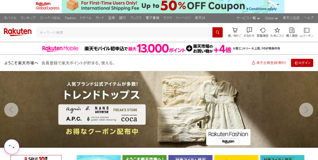
Balance white space carefully
Minimalism is still important in Japanese web design, but excessive white space can sometimes make a page appear unfinished or lacking useful information. Instead of using large empty areas, many Japanese websites prefer structured spacing that keeps content organized while maintaining visual density.
A good approach is to divide hero sections into distinct content blocks, with balanced spacing between headlines, descriptions, visuals, and CTAs. This creates a cleaner experience without making the page feel empty. Ecommerce websites in Japan, for instance, often combine promotional visuals with supporting text and navigation shortcuts directly inside the hero area to maximize information visibility.
Use detail-oriented visuals
Japanese audiences often respond well to visuals that provide context and specificity rather than abstract branding imagery. Hero images that clearly demonstrate product usage, interface functionality, or service benefits can help users understand value more quickly.
For example, a productivity app targeting Japan may perform better with a hero image showing an actual dashboard interface and labeled features, rather than a generic lifestyle photo. Similarly, ecommerce brands often use close-up product visuals, informative annotations, or multiple product angles to reinforce transparency and attention to detail.
Prioritize structured layouts
Structured layouts help users process information more comfortably, especially when a page contains multiple visual and textual elements. Japanese websites frequently use grid-based sections, aligned text blocks, and an organized information hierarchy to guide attention efficiently.
Instead of relying on oversized visuals with minimal supporting content, businesses can create hero sections with clearly grouped elements such as headlines, benefits, product visuals, social proof, and CTAs. This structured approach makes the page feel more trustworthy and easier to navigate, particularly for first-time visitors evaluating a brand.
Hero image localization in Brazil
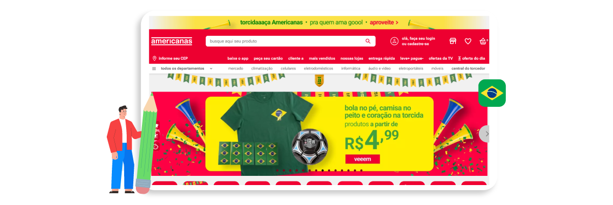
Brazilian audiences often connect more with emotional, social, and energetic visuals. Compared to overly corporate or minimalist hero sections, people-centered imagery with warmth and human interaction tends to build stronger engagement and trust.
Use communal imagery
Group-focused visuals often perform better in Brazil because they reflect social connection and shared experiences. Hero images showing families, friends, teams, or communities interacting naturally can feel more relatable than isolated individual portraits.
For example, a food delivery platform targeting Brazil may achieve better engagement with a hero image showing friends sharing a meal together rather than a single person using the app alone. Similarly, coworking spaces or SaaS collaboration tools can use team-based visuals to reinforce ideas of connection and collaboration.
Highlight emotional connection
Brazilian audiences tend to engage more with visuals that communicate emotion and authenticity. Hero sections that feel emotionally distant or overly formal may struggle to build immediate trust.
Brands can improve engagement by using visuals with natural smiles, relaxed body language, and storytelling-oriented scenes. For instance, a travel website promoting destinations in Brazil may perform better with emotionally expressive vacation moments rather than static landscape photography devoid of people.
Create warmer visuals
Warm and vibrant visuals are often associated with energy, friendliness, and positivity. While this does not mean every hero image should use highly saturated colors, overly muted or cold-looking visuals can sometimes reduce emotional appeal for Brazilian audiences.
For example, ecommerce brands can localize hero banners using brighter lighting, warmer tones, and more dynamic lifestyle photography. Hospitality websites may also benefit from colorful environments and sunlight-rich imagery that create a more inviting atmosphere.
Brazilian ecommerce platforms often use warm colors, bright promotional banners, and energetic human imagery to create a more emotionally engaging shopping experience. Mercado Livre, for example, combines vibrant yellow tones, expressive visuals, and high-energy promotional layouts to create a hero section that feels dynamic, social, and visually inviting for Brazilian audiences.
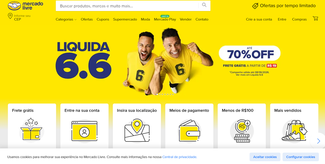
Show expressive human interactions
Expressive gestures and natural interaction can make hero sections feel more authentic and engaging. Static poses or emotionless stock photography may appear too artificial and fail to create a strong emotional response.
A fitness platform targeting Brazil, for example, may achieve better results with energetic group workout scenes, people celebrating progress, or interactive coaching moments rather than isolated studio portraits. These types of visuals help communicate motivation, connection, and shared experience more effectively.
Hero image localization in the Middle East
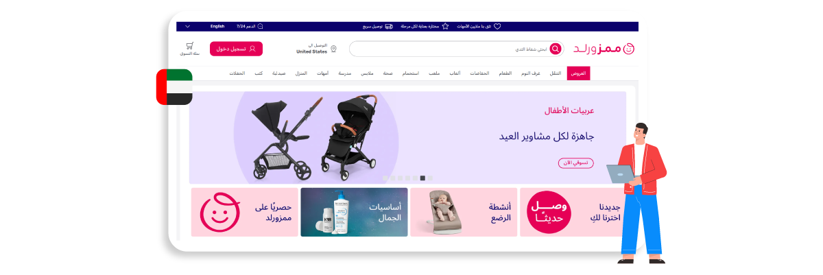
Visual flow, composition, and CTA placement should also adapt to right-to-left reading behavior, especially for Arabic-speaking audiences. Without these adjustments, hero sections can feel visually unnatural and reduce user engagement.
Adapt for right-to-left layouts
Arabic websites are typically read from right to left, which changes how users scan hero sections and process visual hierarchy. Layouts designed for left-to-right audiences may unintentionally guide attention away from important content when used without localization. Because of this, hero image localization for Middle Eastern audiences should adapt layout direction, content flow, and visual balance to match natural browsing behavior.
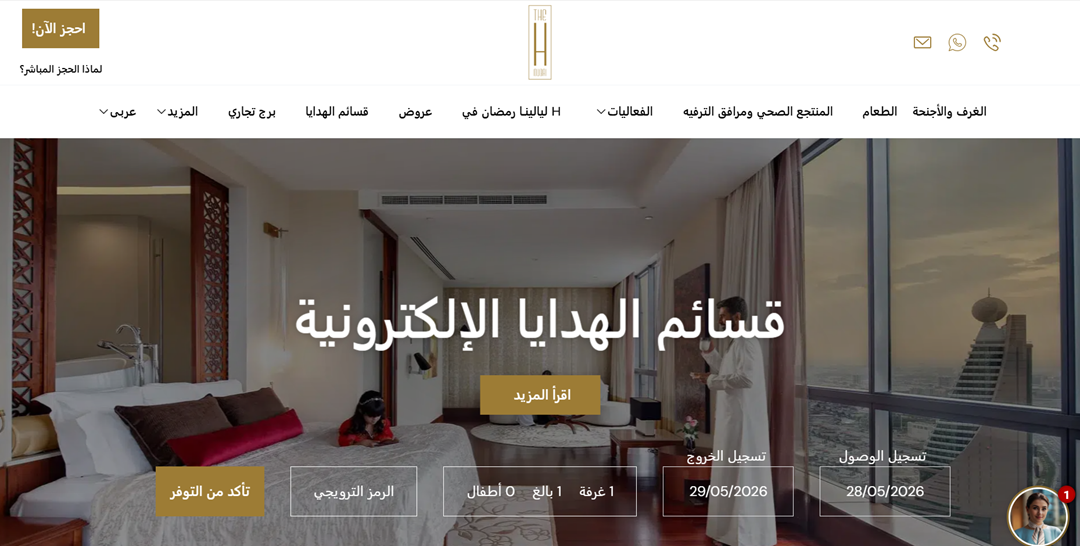
For example, the Dubai hotel website below uses a right-to-left structure that places navigation and key visual elements in a more natural position for Arabic-speaking users. The hero section also combines neutral luxury tones with gold accents, a color style often associated with elegance, exclusivity, and premium hospitality branding in Middle Eastern markets.
Adjust CTA placement
CTA positioning plays an important role in conversion optimization for Middle Eastern audiences. Buttons placed according to left-to-right reading habits may receive less attention because users naturally begin scanning from the opposite direction.
A travel booking platform targeting Middle Eastern markets, for instance, may achieve better engagement by placing booking buttons, promotional offers, or signup forms closer to the right side of the hero section. This adjustment helps users identify the primary action more quickly.
Use mirrored compositions
Images containing directional movement, human gaze, or visual flow should also be adapted for right-to-left audiences. A composition that works well in Western layouts may unintentionally pull attention away from the CTA in Arabic interfaces.
For example, if a hero image shows a person looking toward the left side of the screen, Arabic-speaking users may visually follow that direction away from the intended conversion point. Mirroring the composition so the subject faces to the right can create a more natural flow of attention toward headlines or CTAs.
Avoid left-biased visual hierarchy
Many global websites unintentionally prioritize the left side of the hero section by placing dominant visuals, text blocks, or navigation emphasis there. In Middle Eastern localization, this can create an imbalance because users naturally expect important information to begin from the right.
A SaaS dashboard landing page, for example, may originally display product screenshots on the left and supporting text on the right. For Arabic localization, reversing the layout can improve readability and create a more familiar browsing experience for regional audiences.
Dynamic hero image localization for multilingual websites

Using the same hero image across markets can make a multilingual website feel less relevant to local audiences. Dynamic hero image localization helps businesses display different visuals based on language, region, or audience behavior without creating separate websites for each market.
Swap hero images dynamically
Dynamic hero swapping allows websites to automatically display different hero images depending on the visitor’s language or location. This helps businesses create a more localized experience while keeping website management more efficient.
For example, an international ecommerce brand can show a minimalist, information-rich hero banner to Japanese visitors, while displaying warmer, more community-focused visuals for Brazilian audiences. Instead of manually building separate landing pages, the system automatically loads the most relevant hero version for each user.
Personalize visuals by region
Different regions respond to different visual styles, emotional cues, and design structures. Personalizing hero images by region helps brands create a stronger emotional connection and improve conversion potential.
A global travel company, for instance, may use family-oriented visuals for Middle Eastern audiences, energetic social scenes for Brazil, and more structured promotional layouts for Japan. Even when promoting the same service, adapting visuals to local expectations can make the message feel more natural and relatable.
Keep branding consistent
Localization still needs consistent typography, colors, messaging style, and overall visual recognition across all localized versions.
For example, a SaaS company can maintain the same logo, core brand colors, and CTA style while adjusting hero photography, layout direction, and supporting visuals for different markets. This approach helps brands stay recognizable globally while still feeling locally relevant.
Localize visuals without rebuilding pages
Many businesses avoid visual localization because they assume it requires rebuilding entire websites. In reality, modern localization tools and CMS platforms enable brands to dynamically replace hero images, banners, and other visual assets without manually redesigning every page.
For example, multilingual WordPress websites can use localization plugins or geolocation-based content rules to automatically display region-specific hero sections. This makes it easier to test localized visuals, update campaigns faster, and scale international marketing efforts without increasing development complexity.
For multilingual websites, solutions like Linguise can help streamline localization workflows by making it easier to manage translated content and region-specific experiences without rebuilding pages manually
The color taboo checklist for global hero images

Colors can influence trust, emotion, and user engagement differently across regions. A palette that feels modern and premium in one country may appear too aggressive, emotionally distant, or visually uncomfortable in another. Because of this, businesses should adapt hero image colors to local cultural expectations rather than rely on a single global design approach.
Region | Recommended Color | Avoid | Common Trust Signals |
Japan | Soft neutrals, white, muted blue, balanced grayscale | Excessive empty white space combined with weak contrast | Clarity, structure, professionalism |
Brazil | Warm tones, vibrant accents, energetic color combinations | Overly muted or cold-looking palettes | Emotion, friendliness, social energy |
Middle East | Deep blue, green, gold, rich dark tones | Left-heavy color emphasis or visually aggressive contrasts | Prestige, trust, luxury, stability |
Before launching localized hero sections, businesses should also test color combinations through A/B testing to understand how different audiences respond to visual hierarchy, CTA contrast, and emotional tone across regions.
Conclusion
Hero image localization is no longer just a design preference for multilingual websites. As shown across Japan, Brazil, and the Middle East, visual elements such as layout structure, human imagery, CTA placement, and color psychology can directly influence trust, engagement, and conversion rates. A hero section that feels persuasive in one market may create friction in another if it does not align with local cultural expectations and browsing behavior.
By combining cultural psychology with dynamic hero-image localization, businesses can create more relevant, conversion-focused experiences for global audiences without rebuilding their entire websites. If you want to localize multilingual websites more efficiently while keeping visual experiences consistent across regions, try Linguise to simplify multilingual content and localization management for international markets.