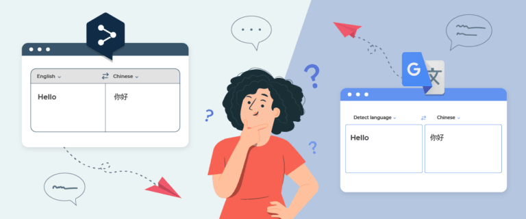
For international users, the language switcher is often the first point of contact for understanding a website. But designing it to be comfortable for everyone, especially users of non-Latin scripts such as العربية, 中文, 日本語, 한국어, или кириллица, is no simple task. How they read, recognize language, and interact with interfaces can differ greatly from English speakers.
That’s why language selector design cannot be one-size-fits-all. This guide will discuss best practices and UX tips for designing an inclusive language switcher, avoiding common mistakes.
Why one language switcher not fit all users?
Not every user selects a language in the same way. What feels obvious to English-speaking users may confuse Arabic or Japanese audiences. Differences in reading direction, language recognition, and interface interpretation mean that a single language switcher design cannot work universally. Here are the main reasons why a one-size-fits-all approach often fails:
- Different reading directions (LTR vs RTL): Latin-based languages are read left to right, while Arabic and Hebrew are read right to left. If a switcher is always placed in the top-right corner without adapting to RTL layouts, users may not find it naturally.
- Users recognize language differently across cultures: Japanese users identify their language more quickly when displayed as “日本語” rather than “Japanese”. Meanwhile, European users may prefer seeing English labels. This makes the choice between native language names vs English labels highly important.
- Icons and symbols are not universally understood: Flags are often used to represent languages, but one language can span multiple countries, and Arabic is spoken in over 20 nations. In some cases, flag usage may introduce unwanted bias or political sensitivity.
- Interaction preferences vary between desktop and mobile users: East Asian users might be more familiar with inline lists or large modals, while European users often expect small header dropdowns. A switcher layout that works in one region may feel awkward in another.
- Trust and familiarity influence click behavior: Users may hesitate to interact if the language switcher looks unfamiliar or culturally out of place. When its format and position match local expectations, they feel more confident switching languages without fear of getting “lost” in another version.
Key design principles for language switchers in non-latin scripts

Designing a language switcher goes beyond simply listing language options. When working with non-Latin scripts like Arabic, Chinese, Japanese, Cyrillic, or Thai, designers must consider how text structure, spatial habits, and cultural expectations influence usability.
Readability & typography for complex scripts
Some scripts, such as Arabic or Devanagari, have more intricate curves and ligatures than the Latin alphabet. If rendered in fonts that are too thin or cramped, characters can look distorted or difficult to read, especially at smaller sizes. Always choose fonts designed specifically for the target script rather than relying on a default Latin font fallback.
For example, Arabic text rendered in Arial may look uneven, but using fonts like Noto Naskh Arabic or Tajawal ensures smoother legibility. Similarly, Japanese kanji should avoid overly decorative styles; fonts like Noto Sans JP or Yu Gothic deliver clarity even at small sizes. A small typography tweak can dramatically improve usability and trust.
Strategic placement for high discoverability
No matter how well-designed a language switcher is, it fails if users can’t find it. Western websites typically place the switcher in the top-right corner, but RTL users may instinctively look to the top-left. Aligning placement with the natural reading direction significantly improves discoverability.
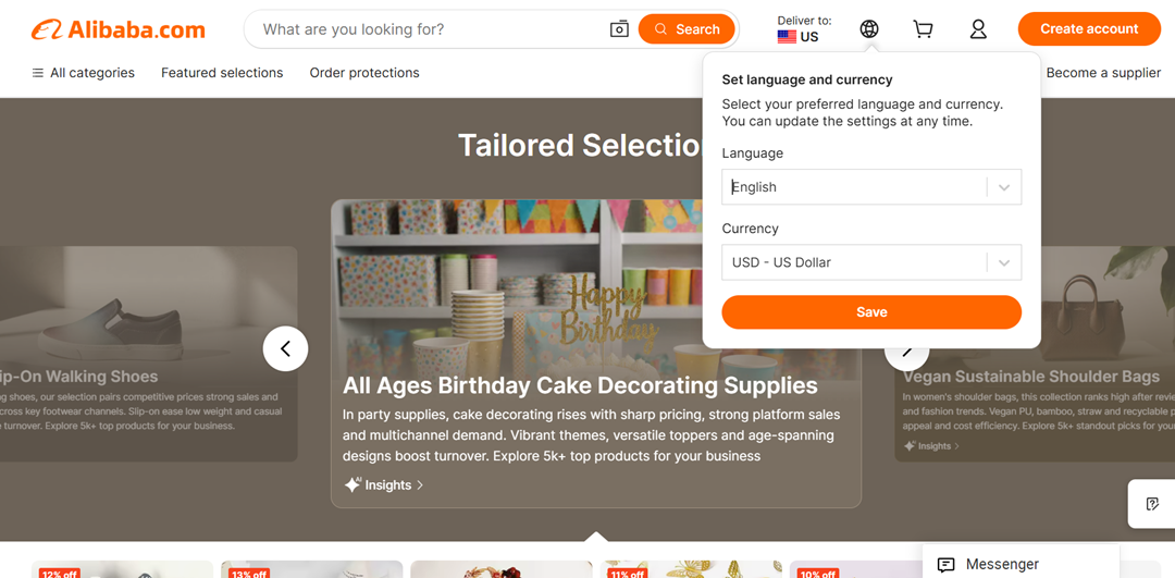
Some e-commerce platforms, like Alibaba, display the switcher in the header and floating format on mobile to ensure it’s always accessible.
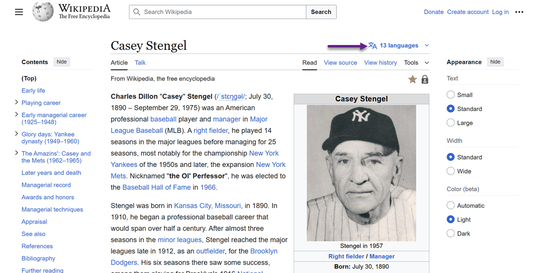
Meanwhile, Wikipedia places it near the article title, which aligns with users’ reading flow.
Rather than sticking to one convention, adapt placement to fit your audience’s dominant reading behavior.
Native language names vs English labels
Language recognition is faster when displayed in the user’s own script. For instance, “日本語” is instantly recognizable to Japanese users, while “Japanese” may require extra cognitive effort. However, relying only on native script can confuse multilingual users browsing outside their region.
The best approach is a hybrid format like “日本語 (Japanese)” or “العربية (Arabic)”, allowing both native speakers and foreign users to understand the option instantly.
RTL (Right-to-Left) layout handling
Switching to an RTL language it must flip the entire UI layout. If only the content changes direction while other elements such as menus, icons, or buttons remain in LTR format, users may feel confused and lose their orientation. Therefore, proper RTL handling includes reversing the position of dropdown arrows, alignment, padding, and hover states so that the entire interface feels natural to RTL users such as Arabic or Hebrew speakers.
The best example can be seen on BBC Arabic, where when users switch to the Arabic version, the BBC logo moves to the right side, the main navigation is rearranged in RTL order, and the entire page structure is consistently reflected.
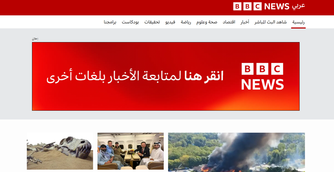
This visual consistency creates a sense of familiarity and increases user confidence.
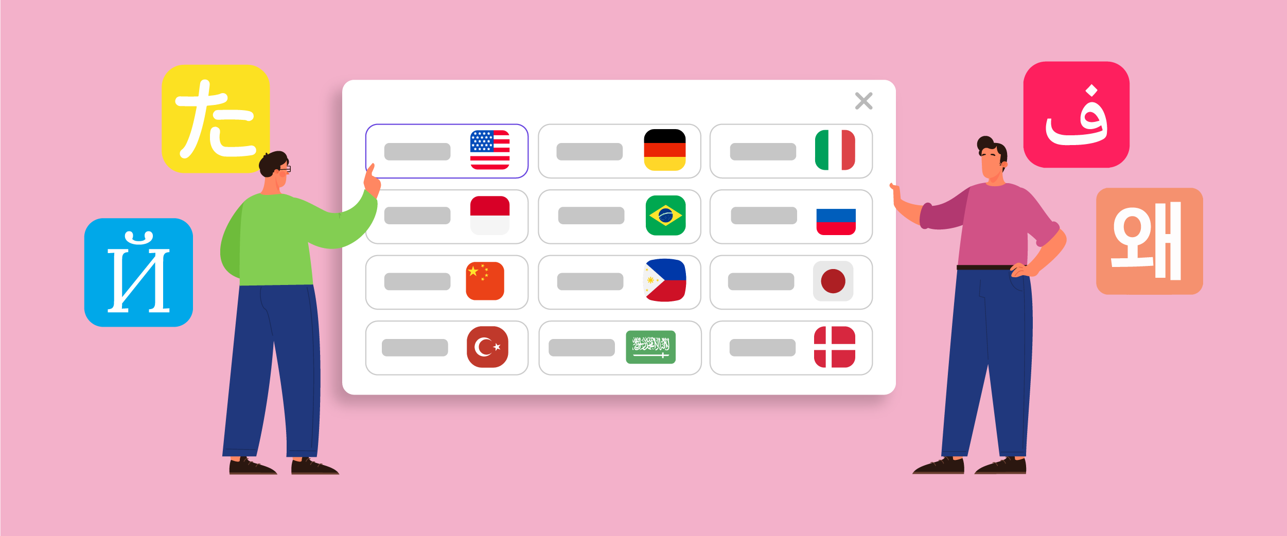
Selecting the right visual identifier for languages
Flags commonly represent languages, but are not always accurate or culturally appropriate. A single language can be spoken across multiple countries (e.g., Arabic or Spanish), and some flags may carry political sensitivity.
Instead of relying solely on flags, consider using well-designed language abbreviations (EN, JA, AR) or script-based icons. Spotify, for example, uses abbreviated text-only labels to avoid misrepresentation. If flags are used, supplement them with text labels to prevent ambiguity, a flag alone is not enough context.
Understanding cultural & behavioral differences

Even when a language switcher is technically well-designed, it may fail if it doesn’t align with how users think, read, or interact based on their cultural habits. Understanding these behavioral nuances is key to creating a language selector that feels natural, not foreign or confusing.
Reading habits and language recognition
People process language options differently based on how they were taught to read. For instance, English users scan from left to right and recognize words by their letter shapes, while Chinese and Japanese users recognize visual blocks of characters as symbols. This means that spacing and grouping matter more in Asian scripts than alphabet-based ones.
Additionally, some users identify languages not by their full names, but by appearance. A Japanese user might scan for kanji that “looks like Japanese,” while an Arabic user expects the curved flow of their script. That’s why displaying language names in their native form greatly improves recognition speed.
Color and symbol sensitivity across cultures
Colors don’t carry the same meaning everywhere. Red might signal urgency in Western cultures, but joy or celebration in China. Due to religious associations, Green is positive in many Middle Eastern countries, but can signal “proceed” or “approved” in the West. Users from different regions may misinterpret it if a language switcher relies heavily on color to show an active or inactive state.
Symbols can also create confusion. A globe icon widely represents languages in global apps, but some users may interpret it as “location settings.” Likewise, speech bubble icons are more associated with chat rather than language. Always test whether icons are universally understood, not just popular in Western UI kits.
Familiarity and trust in interaction patterns
Users are more likely to click what feels “normal” to them. In Japan, modal pop-ups are a familiar pattern for setting changes, while European users often expect dropdown menus instead. If the language switcher uses an unfamiliar interaction, users may hesitate, unsure of what will happen next.
Trust also plays a role. In regions where people are cautious about accidental redirects or losing their progress, they may avoid clicking a switcher if it feels risky. That’s why smooth transitions, without full-page reloads or confirmation pop-ups, help build confidence and make switching feel safe and intentional.
Common language switcher mistakes to avoid

Even well-intentioned language switchers can frustrate users if executed poorly. Many websites unknowingly create friction simply because they rely on Western design assumptions. Below are the most common pitfalls that reduce usability, especially for non-Latin audiences.
Mixing latin & non-Latin scripts without visual hierarchy
Placing multiple language options like English | 日本語 | العربية | Русский in one row without spacing or visual guidance can be overwhelming. Each script has different heights and shapes, so they often look visually unbalanced when placed together. Users may struggle to scan or tap the correct option without proper padding or separators.
To avoid confusion, group scripts with consistent sizing or apply visual dividers. Some websites use subtle borders, bullet points, or separate rows for different script types. The goal isn’t to separate users, but to make the list more readable for everyone.
Hiding language switchers in deep menus
One of the most frustrating experiences for users is having to dig through menus just to change the language. Placing the switcher inside a footer or buried within a settings page forces extra effort, many users give up before finding it. This is especially problematic for first-time visitors who use the wrong language version.
A language switcher should always be visible or at least one click away. Many multilingual websites use a sticky floating button or place it in the main navigation bar. When it comes to language access, accessibility should always outweigh aesthetic minimalism.
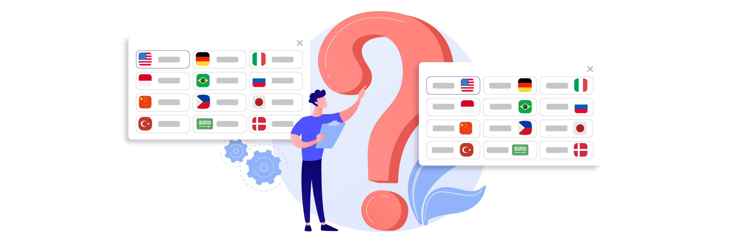
Over-relying on flags or auto-detection
Flags might seem visually appealing, but they rarely accurately represent languages. Spanish is spoken in over 20 countries, and Arabic is spoken across the Middle East and North Africa, so which flag should represent them? Worse, some flags can trigger political sensitivities or confusion.
Auto-detection also isn’t foolproof. A user traveling abroad or using a VPN may be incorrectly redirected to a language they don’t understand. The safest approach is to always offer manual selection, with clear text labels rather than relying solely on visuals.
Making users confirm the language switch repeatedly
Some websites interrupt users with confirmation pop-ups like “Are you sure you want to switch to Arabic?” every single time, creating unnecessary friction. Switching languages should feel seamless, not like submitting a risky request.
Once a user selects a language, remember their preference using cookies or session storage. Only prompt confirmation if the action will significantly change context (e.g., redirecting to a new domain), not during normal browsing.
Ignoring mobile and RTL responsiveness
A switcher that works perfectly on desktop may break on mobile overlapping text, misaligned icons, or dropdowns that extend off-screen. This gets worse with RTL languages, where some layouts fail to mirror correctly, leaving arrows or paddings facing the wrong direction.
Always test the switcher on mobile viewports and in RTL mode. A small shift in alignment or hitbox size can greatly affect usability on touch devices. Better yet, design mobile-first to ensure resilience.
Best practices for implementing language switcher UI

Once the key principles are understood, the next challenge is choosing how to implement your language switcher effectively. The right structure and interaction model can greatly influence how quickly users locate and engage with it. Below are best practices that ensure usability and performance across different devices and cultures.
Dropdown vs modal vs inline list
Different layouts suit different contexts. Dropdowns are compact and ideal for navigation bars, but can feel cramped if there are many language options. Modals provide more space and are great for multilingual platforms with dozens of languages, but should open quickly to avoid feeling intrusive. Inline lists are the most visible, making them perfect for landing pages or footers where discoverability matters more than space efficiency.
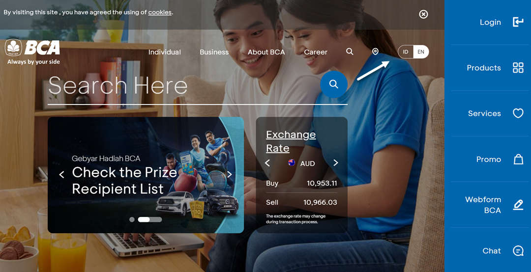
When choosing the right format, consider the number of languages and the type of users. A site with only two languages (e.g., English–Indonesian) might not need any dropdown, just clear toggle buttons.
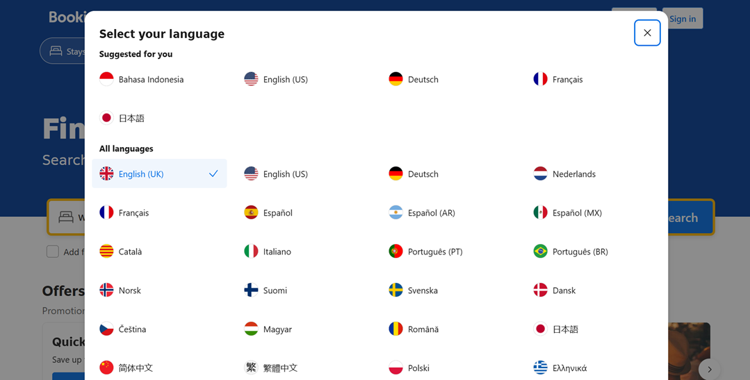
Meanwhile, a large global platform like Booking.com benefits from a modal grid layout, allowing users to scan visually.
Keeping switchers accessible on mobile & touch devices
A language switcher that’s easy to click with a mouse may be difficult to tap on a mobile. Tiny dropdowns with narrow hit areas can frustrate users, especially when scripts like Arabic or Thai occupy more vertical space. Ensure touch-friendly sizing with sufficient padding and spacing to avoid accidental taps.
Positioning also matters on small screens. Some apps keep the switcher inside the menu icon (☰), while others use floating buttons anchored to the bottom corners. Users won’t feel stranded in the wrong language if the switcher is always reachable within one tap.
Testing with native speakers
No matter how polished a design looks, assumptions can be misleading, especially when dealing with unfamiliar scripts. Conducting quick usability tests with native speakers helps uncover issues that non-native designers may miss. For example, a font that seems “fine” to you may feel childish or outdated to someone fluent in that language.
Testing doesn’t have to be formal or expensive. Even informal feedback from colleagues or online community members can reveal whether your icon choices, wording, or layout feel culturally natural or awkward. A few minutes of real-world validation can save users from long-term confusion.
Ensuring fast switching without page reloads
Slow transitions are one of the biggest barriers to language switching. Users may abandon the process midway if the page refreshes completely or reloads heavy scripts. Use soft transitions or AJAX-based switching, allowing content to update instantly without breaking flow.
Many modern translation tools now support instant language swapping, updating only the necessary text elements instead of reloading the entire document. This not only improves UX but also encourages users to explore multiple language versions without hesitation.
Preserve scroll position after language switch
Imagine scrolling halfway through an article, switching to another language, and suddenly being bumped back to the top. This breaks reading continuity and can be especially frustrating on long-form content like blogs or documentation. Preserving scroll position ensures that users can continue reading exactly where they left off, no matter the language.
This can be achieved with simple JavaScript logic or built-in translation tools that remember scroll state. The smoother the transition feels, the more comfortable users will be to experiment with multiple languages.
How Linguise simplifies language switcher design for non-latin audiences

Designing an inclusive language switcher from scratch can be time-consuming, especially when you need to handle RTL layouts, script rendering, and UI customization for different cultures. Thankfully, tools like Linguise make the process much easier by offering built-in features tailored for multilingual and non-Latin experiences.
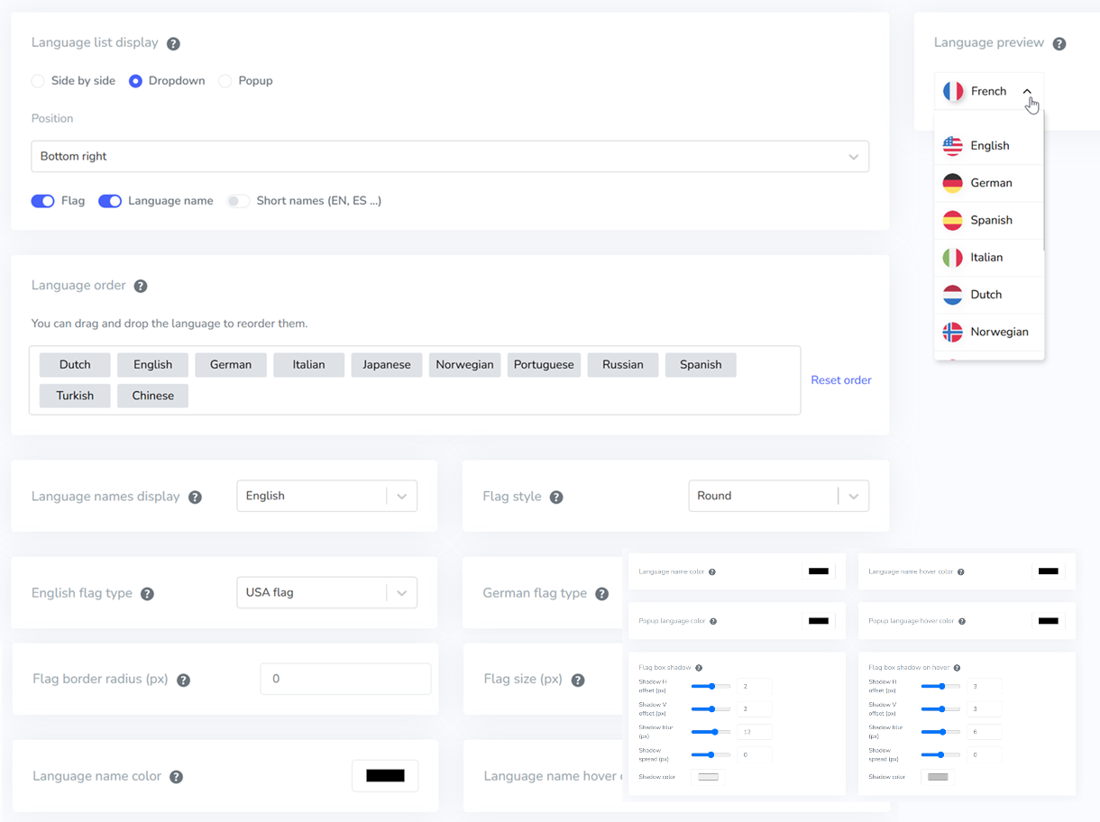
Fully customizable switcher layouts
Linguise lets you choose how your language switcher appears, whether as a dropdown, inline list, floating button, or modal-style panel. You can adjust the size, position, label format (native names, English names, or both), and even choose between text-only or icon-based styles. This flexibility ensures the switcher blends naturally with your website’s design rather than feeling like an afterthought.
Automatic RTL formatting
When languages like Arabic, Hebrew, or Persian are selected, Linguise instantly applies right-to-left (RTL) direction across the switcher and its menu items. There’s no need for custom CSS or conditional logic, all paddings, arrows, and alignments are automatically mirrored. This gives RTL users a familiar navigation flow and eliminates layout inconsistencies.
Reliable font handling for all language scripts
Not all fonts properly support complex scripts, often leading to misaligned characters or fallback fonts appearing randomly. Linguise ensures that each script is rendered using web-safe or language-specific font recommendations, keeping the switcher readable and consistent across all languages. Whether Arabic, Chinese, Thai, or Cyrillic, every option stays visually balanced.
Conclusion
Designing a language switcher UI for non-Latin script users it’s about respecting how different cultures read, recognize, and interact with interfaces. From typography and RTL layout handling to placement and icon choices, every detail can impact whether users feel included or alienated. A small improvement in clarity or accessibility can lead to higher engagement, better retention, and smoother global user experiences.
Instead of manually building complex multilingual logic, tools like Linguise offer a faster and more reliable way to deliver a culturally aware language switcher across all scripts. If you want to implement automatic RTL formatting, readable typography, and fully customizable switcher layouts without the development hassle, try Linguise and see how effortless inclusive localization can be.