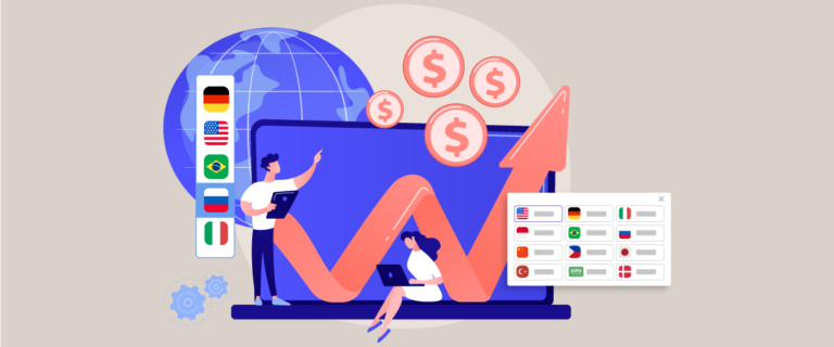
The language selector is an important element that you should pay close attention to when creating a multilingual website because the language switcher is what users will often visit when they want to switch languages.
An effective language switch button can provide several benefits for a website, from increasing web optimization to increasing sales.
In this article, we will discuss best practices for designing language selectors. Let’s discuss it further in the following article.
Keypoints: Best practices for designing language selector
Strategic placement maximizes usage
Header/desktop and hamburger/mobile menu placement ensures accessibility without disrupting user experience or page speed.
Smart auto-detection with override
Detect browser language but always provide easy manual override and remember user preferences via cookies.
SEO + accessibility essential
Implement hreflang tags, ARIA labels for screen readers, touch-friendly design, and JavaScript-free fallback for crawlers.
What is a language selector?

A language selector is a user interface element or feature that allows users to select the language with which they wish to interact with a website, application, or any digital platform. It is commonly found on websites, software applications, and other digital interfaces to suit users who speak different languages.
The language selector usually displays a list of available languages, and the user can select the language of his choice from that list. Once selected, interface content, including text, labels, and sometimes images, will be displayed in the selected language. This is especially important for websites and apps that serve a global audience or diverse user base.
Language selectors contribute to a better user experience by making digital content accessible to a wider audience, regardless of their language skill level. They are a key component of locality efforts, allowing developers and designers to adapt their products to different linguistic and cultural contexts.
Why need to customize your language switcher?

Customizing the language switcher on a multilingual website has several important benefits.
- Brand alignment and visual style: By customizing the language switcher, you can ensure that the look and style of the language used are consistent with your website’s branding and visual style. You can customize language switch buttons or menus to fit the overall design of your website, creating consistency in the user experience.
- Greater control over displayed languages: Sometimes, you may want to limit certain languages displayed in the language switcher. For example, you may have a limited version of your website in several languages, and you only want to display those languages in the language switcher. By customizing the language switcher, you can choose which languages are displayed, giving you more control over the available content.
- Optimized user experience: By customizing the language switcher, you can create an optimized user experience. For example, you can adjust the layout or position of the language switcher to make it easy for users to find. You can also add features such as notifications or language-switching instructions that help users understand how to use the feature easily.
- Meet different user needs: Every user has different language preferences. By customizing language switching, you can meet the needs of users from different language backgrounds. This could include local users, international visitors, or users who are more comfortable in a different language.
- Increase sales conversion: proper language switcher customization can also provide the benefit of increasing sales conversion. Because an effective language switcher can provide user comfort when interacting with your website. According to CSA Research data, 72.4% of consumers said they would be more likely to buy products that had information in their own language. So it is impossible that your sales level will also increase.
Different types of language selector
Every website owner will certainly consider carefully what their language selector looks like, each website will of course have different preferences. For those of you who are looking for a type of language selector that can be used, here are some of them.
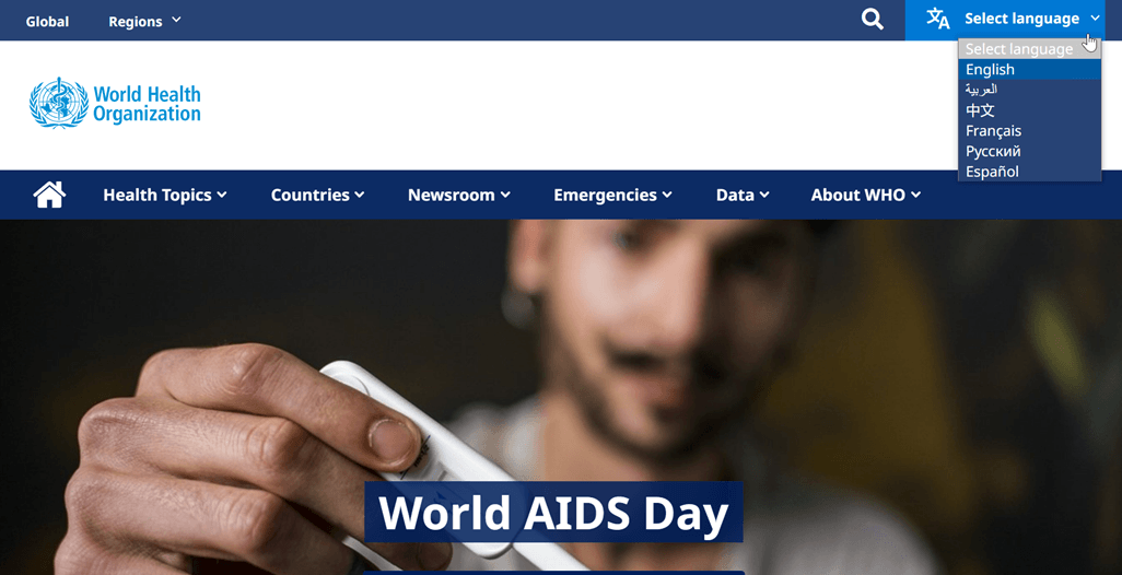
Language button
This is one of the commonly used types of language switcher. The language button is usually an icon or text that indicates the language being displayed, for example, “EN” for English or a country flag to represent a specific language. When users click the language button, they will be redirected to the version of the website in the appropriate language.
For language buttons, it is recommended to display a limited number of languages to avoid a cluttered display. Generally, having more than 4 to 5 languages can create a busy visual effect. It is important to position the button in a visible location so that users can easily find it. We will discuss these aspects further in the next section of this article.
Language buttons may be suitable for businesses that target specific markets or serve international communities in certain locations. An example of using the language button on the WHO website is as below.
Text link
Text links are a type of language switcher that uses text in the form of the language name as a link. For example, you can display text links such as “English,” “Français,” or “Español” that take users to a version of the website in the selected language. This text link is usually placed in a list or dropdown menu to make it easier for users to select the desired language.
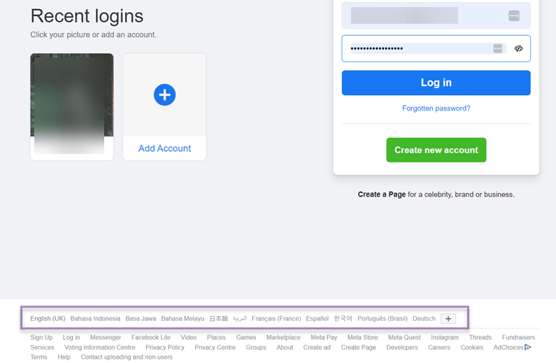
One type of link language selector is used by the big company Facebook, in addition to the languages listed, you can also press the (+) icon to find more languages.
After that, the page will be immediately translated into the previously selected language.
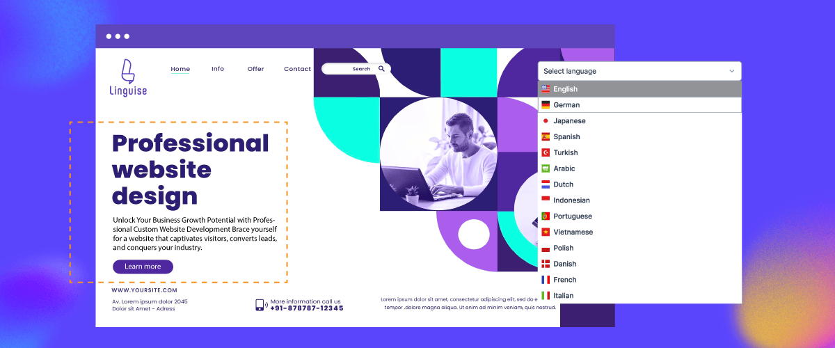
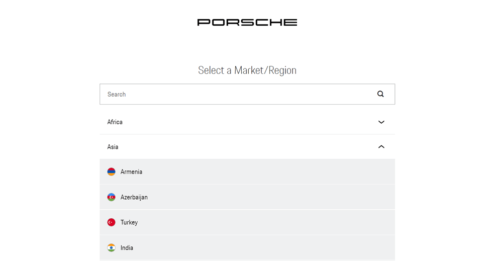
Selection menu
A selection menu is a type of language switcher that uses a dropdown menu or open menu to select a language. When users click on the options menu, they will see a list of available languages and can select the desired language. The options menu can contain country icons or flags as language indicators, as well as language names in the text.
The selection menu is quite different from the language button, this type is more complex than just a button. Like the example below which comes from Porsche’s website.
They provide a language selector website where users can directly write down their language or destination country.
Dropdown vs. List vs. Pop-up: Which works best?
Choosing the right interaction model for your language selector is crucial to delivering a seamless and intuitive user experience. Each method—whether dropdown, inline list, or pop-up, offers different advantages depending on your website’s layout, number of supported languages, and user behavior. Below is a comparison of the three main interaction models for language selection, focusing on UX, accessibility, and implementation context.
Type | Strenghts | Limitations | Best Use Case |
Dropdown | Compact, clean, scalable, with many languages | Requires interaction (click/tap), may not be obvious to all users | Multi-language websites with space constraints |
Text List | Visible without interaction, faster access for key languages | Can clutter UI, not scalable for many languages | Sites with 2–4 primary language options |
Pop-up | Can include a search field, flexible UI design | May disrupt user flow, needs a clear close button and accessibility | Global sites with 10+ languages |
Language selector best practices and tips

Designing an effective language selector involves delivering a seamless experience across all devices and ensuring accessibility for users of various backgrounds. With an increasingly global audience, your language switcher should be intuitive, accessible, and responsive to ensure users can interact comfortably in their preferred language.
Below are best practices you can apply to ensure your language selector is clear, convenient, and accessible for all users.
Prioritize responsive design
Most users access websites from mobile devices, so your language selector should be responsive and mobile-friendly. Ensure the button or menu is easy to tap, does not cover important content, and remains visible on smaller screens.
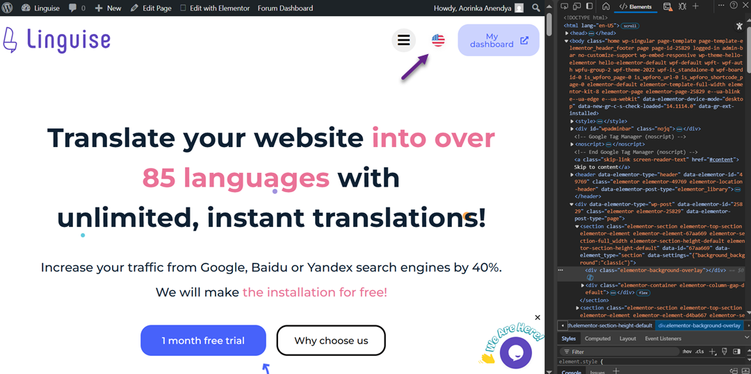
For example, the language selector website looks like this.
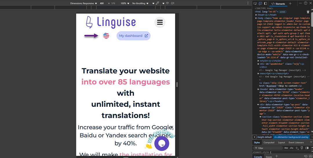
Then, when looking from the mobile side, the language selector can still be accessed easily and does not move or disappear.
Use dropdowns or expandable menus to keep the layout tidy, and ensure touch targets have enough spacing for comfortable interaction. This helps users select their preferred language easily without frustration caused by cramped or hard-to-click elements.
Thoughtful placement in the interface
Place the language selector in highly visible, expected areas such as the top-right corner of the header or the bottom footer. These are intuitive locations where users typically look for language options.
Avoid hiding the selector inside ambiguous icons or secondary menus. Keep its placement consistent across all pages so users who switch languages frequently can find it easily at any time.
Use accessibility attributes (ARIA)
To ensure your language selector is accessible to users with disabilities, use ARIA (Accessible Rich Internet Applications) attributes such as aria-label, aria-haspopup, and aria-expanded. These help assistive technologies like screen readers understand the element’s role and functionality.
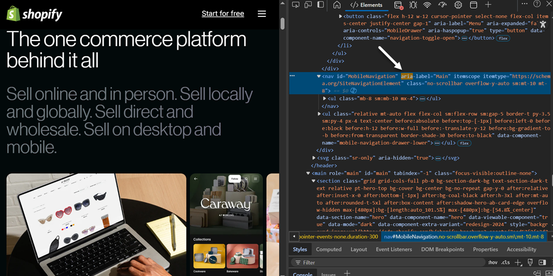
Implementing accessibility meets WCAG standards and ensures your site is inclusive and usable by a wider audience. Inclusive design benefits everyone, not just users with specific needs.
Use clear and recognizable language labels
Display each language option using its native label, for example, “Español” instead of “Spanish” or “Deutsch” instead of “German.” This allows users to quickly recognize their preferred language, even if they don’t understand the current site language.
Native labels are more inclusive and reduce cognitive load, especially for international users. Avoid using obscure abbreviations or language codes unless your audience knows them.
Avoid overloading with too many options
Showing too many language options at once can clutter the interface and confuse users. Display only the most relevant or commonly used languages first, and place the rest in a dropdown menu or under a “More languages” section.
This keeps the interface clean and improves usability, especially on mobile. Use website traffic analytics to decide which languages should be prioritized or hidden.
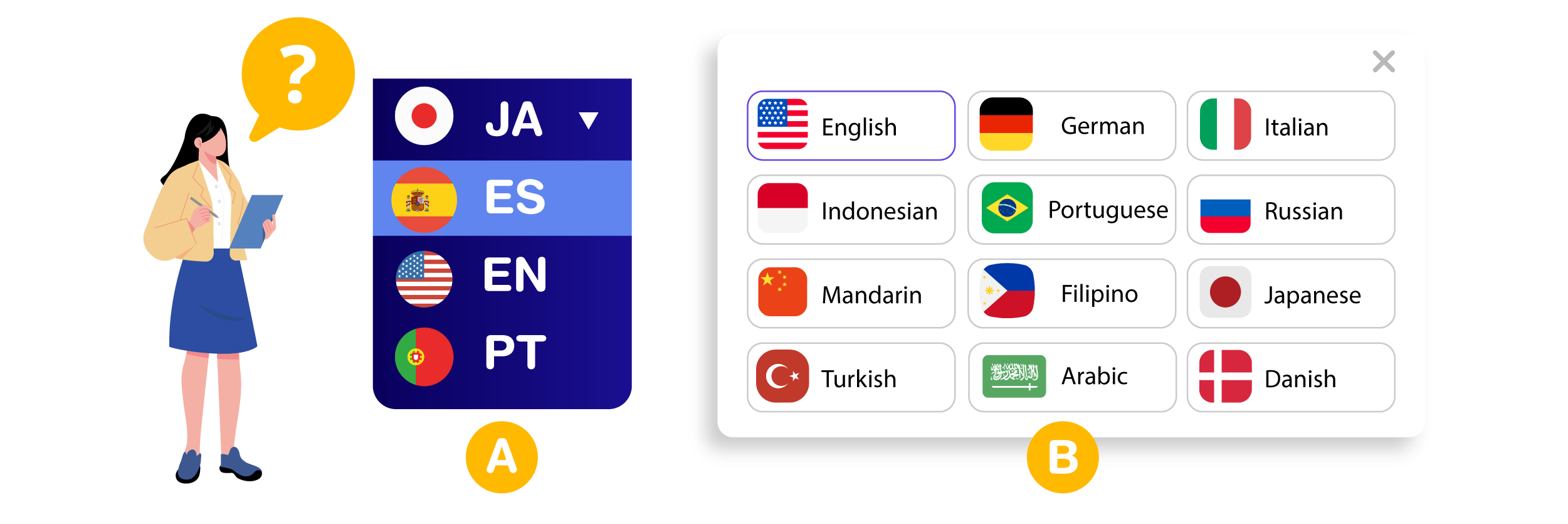
Use appropriate icons and visual cues (without relying on flags)
Visual cues like globe icons (🌐), downward arrows (▾), or active state highlights help users understand that an element is clickable. However, avoid using national flags to represent languages, as one language can be spoken in multiple countries.
Flags may also carry cultural or political implications. If you use visuals, pair them with text labels to ensure clarity, and keep icons consistent and culturally neutral across your design.
Stay consistent with website design and branding
Your language selector should visually align with your website’s overall style. Whether using buttons, text links, or icons, ensure that typography, colors, and hover states match your branding. This improves trust and strengthens the user experience.
If you’re building a custom selector, test it across different browsers and devices to ensure it works as intended. Consistent design and reliable functionality contribute to a seamless multilingual user journey.
Setting a language selector with Linguise in 7 steps
At this point, you know the best practices for language selectors. This translation can be done after you use the website translation service. However, not all translation services provide flexibility in language selector settings.
But you don’t worry because Linguise is not like that. Linguise is an automatic translation service that provides user customization of the language switcher. Some of the benefits you will get when using Linguise include.
- Linguise can be used and integrated into more than 40 CMS (WordPress, Joomla, Drupal, etc).
- Translation into various languages will be done automatically in just seconds after you add the language to the language switcher on the website.
- There are more than 80+ languages available that can be added to the language selector.
- Linguise will automatically prepare a unique URL according to the translation destination language. For example the URL linguise.com/de/ for a page that is being translated into German.
- It will automatically create a canonical URL to help avoid duplicate content in search engines when you have language variations on a page.
- You can setup language switcher flexibly according to website needs, starting from the icon, and color, to the language name.
- You can view visitor page view statistics per language, for each language added to the language selector.
In this tutorial, we will use WordPress as an example of the CMS used.
Step 1: Registering Linguise free account
To access the language switcher on Linguise, the first step you need to do is register an account on Linguise. Linguise also offers a one-month free trial, which includes a variety of features you can take advantage of.
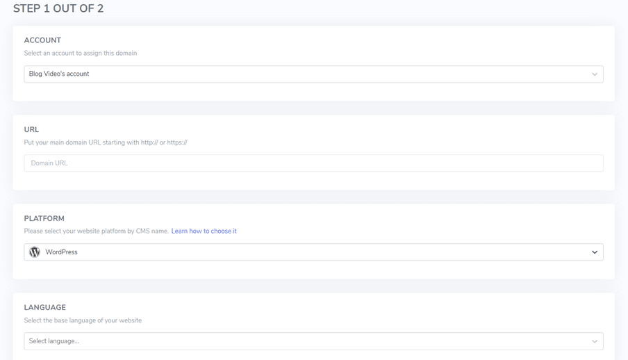
Step 2: Add domain to your multilingual website
The second step is to add the website domain in Linguise that you already own to the Linguise dashboard. There are several things you need to fill in, starting from.
- Account
- URLs
- Platform
- Language
- Translation language
- Translate URL
After that, you need to activate the API key and set the language URL. For a complete guide to adding a website domain, you can read the documentation, while specifically for WordPress, you can see it by install Linguise automatic translation on WordPress or watching the video tutorial below.
Step 3: Install the plugin Linguise
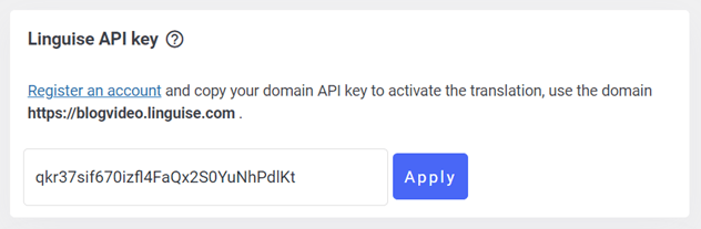
After successfully adding a website, then open the WordPress dashboard and install the Linguise plugin, do this by Plugins > Add New > Linguise > Install > Activate.
If the plugin is already installed, go to the Linguise dashboard and copy the API key.
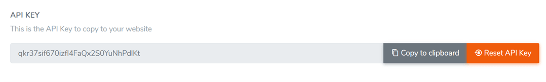
Then open the Linguise plugin and paste the API code that you got from the Linguise dashboard into the following column.
Step 4: Setup main display
To configure a language switcher or display language flags, the steps are via the Linguise dashboard in the Settings > Language flags display menu.
During the initial setup, we will make adjustments to the main display, taking into account the different components.
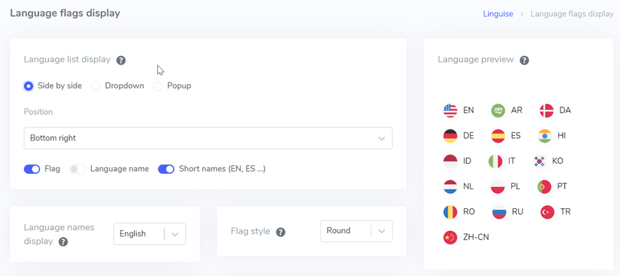
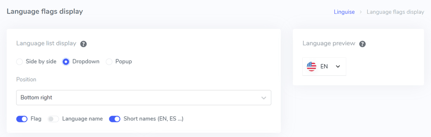
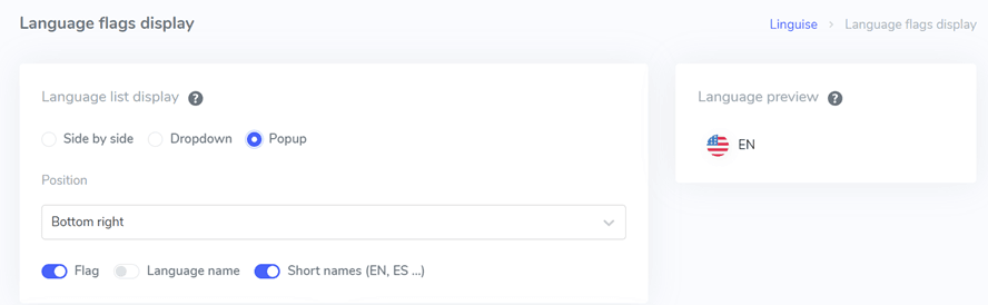
One initial consideration is the configuration of the language list display format, which offers three options to choose from: side-by-side, dropdown, or popup. On the left side, there is a preview display for each format.
The first format, as shown below, is a side-by-side layout.
The following format adopts a dropdown style, as depicted in the image below.
Lastly, we have the popup format as the final option.
Next, we proceed to the next step, which involves configuring the position of the language switcher. You have the flexibility to choose from various position options, so it’s important to select a position that is easily noticeable to visitors.
Finally, you need to decide on the combination preference for displaying the language options. You can choose between options such as flag + language name, flag + short name, or simply displaying the flag alone. This decision will depend on your specific design preferences and the preferences of your target audience.
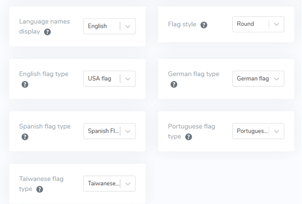
Step 5: Set flag design
After that, below the main display section, you will come across design configurations specifically for the flag. The image provided below demonstrates some of the available setting options.
- Language name display: You have the option to display the language name based on either the country or the language itself. For example, you can choose to display “German” or “Deutsch.”
- English flag type: This option is applicable when dealing with languages that have multiple variations, such as “English USA” or “English Britain.” Similar choices can be made for languages like Spanish, Taiwanese, German, and Portuguese.
- Flag style: This setting enables you to define the shape of the flag icon, whether it should be round or square (rectangular).
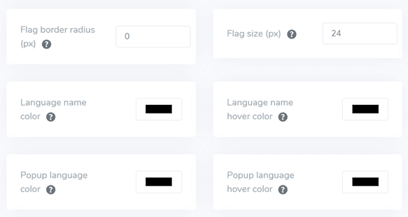
Step 6: Set the color and size of the flag
Once the flag design is set up, the next step involves adjusting colors, size, and various other elements. In the following interface, you will find numerous customizable settings, including:
- Flag border-radius: This allows you to personalize the border radius in pixels when using a rectangular flag.
- Language name color: You can select the default text color for the language name.
- Popup language color: This setting determines the color of the language title in the popup or dropdown areas.
- Flag size: You have the option to modify the size of the flag according to your preferences.
- Language name hover color: This setting controls the text color when hovering the mouse over language names.
- Popup language hover color: Similarly, this setting determines the text color when hovering the mouse over the language title in the popup or dropdown.
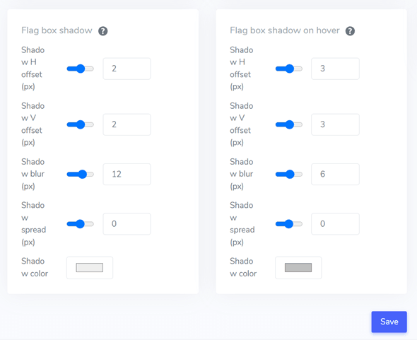
Step 7: Set flag box-shadow
In the final phase, you have the opportunity to customize the shadow settings for the flag. The initial setting allows you to specify a shadow for each flag displayed on your website, while the subsequent setting pertains to the shadow effect when hovering over the language flag.
Remember to click on the Save button to preserve the customization settings you have made for the language switcher. This ensures that your selected configurations for the shadow effects are implemented and saved for future use.
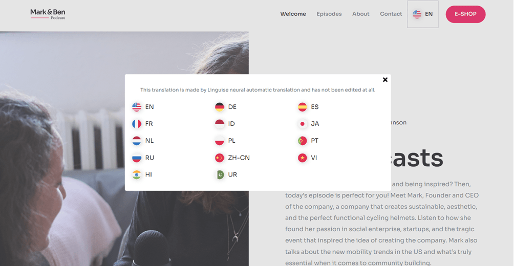
After all the configurations have been carried out, here is an example of the language selector display using a popup, positioned in the top right corner, and using initials. This is just an example, you can customize the rest as you wish and according to the website’s needs.
Apart from WordPress CMS, you can also use other website platforms and follow the detailed guide such as setup switcher for OpenCart, language switcher for Drupal, and setting switcher for PrestaShop.
Design your language selector for a seamless multilingual experience with Linguise!
Here, you have gained insight into best practices for designing language selectors and how to do it using Linguise! Believe me, creating a language switcher can provide many benefits and ensure optimization based on the points mentioned above.
When creating a language selector, make sure to follow the tips and best practices that we have explained above, starting from using icons, and selecting relevant languages, to positioning.
Now, register a Linguise account, add your website, and fine-tune the language selector to provide a better user experience. Don’t forget to try the 1-month free trial feature to enjoy Linguise’s superior features!