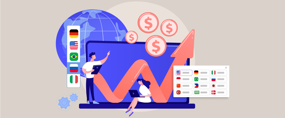
Language switchers are often seen as small UI elements, yet their impact on user experience and conversion rates can be surprisingly significant—especially for international audiences. When users cannot quickly find the language option, they may leave the page immediately because they feel confused or cannot understand the content.
The UX of a language switcher influences how fast users can navigate, understand the content, feel trust, and ultimately make decisions. Understanding the psychology behind user behavior and strategically placing the language switcher can significantly boost conversions across global markets.
Keypoints: Psychology of language switcher & how to placement
Top-right placement wins
Users look for language switchers in the top-right header first, boosting visibility and switching rates.
Text beats flags
Clear language names like "Español" avoid confusion and improve international user trust over ambiguous flags.
Mobile-first optimization
Sticky or accessible mobile placement prevents frustration and lifts conversions by 39%.
Why language switcher UX influences global conversions?

A well-designed language switcher that’s easy to find makes users feel valued and prioritized. Conversely, a switcher that’s hidden or unclear increases friction, confusion, and decreases trust among international users.
This matters even more because studies show that optimizing user experience can increase conversion rates by up to 39%, demonstrating the importance of ease of use and clear navigation, including the speed at which users can find and use the language switcher.
A language switcher has a direct impact on how international users interact with your website. When visitors can easily find and use it, they feel welcomed and supported. But when it’s hidden or confusing, it quickly creates frustration and reduces trust.
- Ease of discovery improves engagement: When the switcher is placed in a familiar and visible location, users can switch languages instantly without disrupting their workflow. This reduces friction and keeps them browsing longer.
- Clarity reduces confusion: Clear labels, readable text, and intuitive design help users avoid mistakes—such as selecting the wrong language or missing the switcher entirely.
- Trust increases when users feel acknowledged: International visitors feel more respected and included when language options are easy to access, which boosts overall credibility and confidence in the brand.
- Faster comprehension leads to higher conversions: When users can switch to their preferred language quickly, they understand the content better, process information faster, and are more likely to complete key actions.
- Lower friction prevents abandonment: If switching language requires extra steps or feels hidden, users may get frustrated and leave the website before engaging further.
The psychology behind language switcher behavior

A language switcher is closely tied to how users think and process information when trying to find and use this feature. Every element, from placement to symbols, influences how quickly users feel comfortable and whether they continue their journey on the website or decide to leave.
User findability patterns
Users rely on established browsing habits formed from their experience across various websites. Because most websites place language switchers in familiar areas—such as the top-right corner or the main header—users bring those expectations wherever they go. When those expectations are met, the process feels natural and effortless.
However, when the language switcher is placed somewhere unexpected, users must pause and “search” for it. This increases mental effort and can lead to frustration. The longer they spend looking for it, the higher the chances are that they will lose interest and drop off the page.
Regional UI expectations
Each country or region has different interface expectations. For example, many European users are accustomed to seeing language switchers in the header, while some Asian regions find flag icons more intuitive and recognizable.
When a website follows patterns that match the habits of its target region, users feel comfortable because the design feels familiar. However, when regional expectations aren’t met, the interface can feel foreign or confusing, which lowers overall user satisfaction.
Cognitive effort
Cognitive effort refers to the amount of mental energy required to understand and utilize a particular element. If the language switcher is easy to see and clearly designed, users can process it automatically without much thought.
If the design is unclear or the placement is hard to spot, users must exert more attention and mental effort. This increased cognitive load can lead to fatigue, causing users to leave the site before successfully switching languages.
Trust & credibility
Users often judge a website’s credibility based on small UI details, including language switchers. A clear, well-organized, and easy-to-find language switcher signals professionalism and international friendliness, which boosts user trust.
On the other hand, if the switcher is hidden, cluttered, or uses inaccurate symbols, users may feel that the website doesn’t fully understand their needs. This uncertainty can cause them to hesitate and refrain from engaging further, especially when they need to enter personal data or complete a transaction.
Cultural influence
Cultural norms also shape interface design. Symbols or colors can carry different meanings across cultures. For example, using flags can be culturally inaccurate if the flag doesn’t represent the language correctly (e.g., Spanish is not only spoken in Spain).
When a language switcher is designed with cultural sensitivity, users feel understood and respected. Without this awareness, the design may cause discomfort or confusion, leading to a lower-quality user experience.
Options language switcher placement

Header placement
Placing the language switcher in the header is one of the most effective approaches because users naturally explore the top of the page when they first arrive. This area is obvious and accessible across almost all screen sizes, making it a reliable choice for most websites. Users can switch languages immediately before interacting with any other elements.
The header also gives a sense of structure and professionalism. Many well-designed global websites follow this pattern, which reinforces user expectations. When your design aligns with these expectations, users feel more comfortable and confident navigating your site.
Additionally, header placement works well for websites with multilingual SEO strategies, as it supports a consistent user experience. Users don’t have to scroll or search, reducing friction and increasing the likelihood they stay and convert.
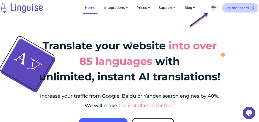
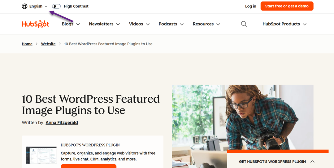
Top-right position
The top-right position is the most recognizable and widely accepted location for language switchers worldwide. Users have learned from years of browsing that settings—such as account menus, notifications, and language controls—often appear on the upper-right area of the interface, making it almost instinctual to look there first.
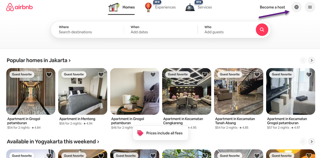
From a usability standpoint, this placement minimizes the time needed to locate the switcher. Users can quickly scan the corner, find the icon or text, and change languages without extra steps. This speed is essential for international visitors who may not be familiar with the default language.
The top-right placement also fits naturally into responsive designs. Even when the layout changes on smaller screens, the corner area often remains accessible, providing a consistent experience across devices. This consistency helps reduce confusion and maintain trust.
Footer placement
Footer placement is less ideal for visibility, but some websites use it to maintain a clean, minimalist header. It’s a useful option for platforms where language switching is not a primary action or where users are expected to scroll to the bottom naturally—such as documentation or long-form content pages.
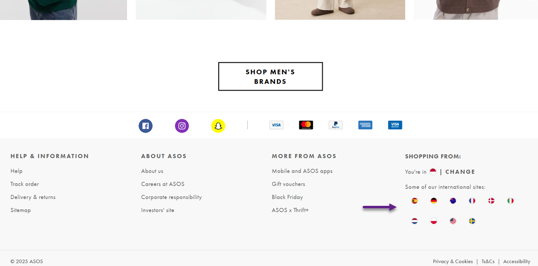
However, placing the switcher in the footer often results in lower engagement. Many users never reach the bottom of the page, and those who do may already feel frustrated after searching for the switcher in more common locations. This can negatively impact both usability and conversions.
Even so, footer placement can be effective if the audience is already familiar with your interface or if you provide additional language hints throughout the page. Supporting elements, such as localized links or banner prompts, can help guide users to the footer without requiring them to guess.
Mobile menu placement
On mobile devices, screen space is limited, so many websites hide the language switcher inside the hamburger menu. This keeps the interface clean while ensuring that essential navigation elements remain accessible within one tap.
While this placement is common, it reduces visibility because users must open the menu to switch languages. If they are unfamiliar with your site, they may not immediately think to check inside the menu, causing a slight delay in finding the setting.
Despite this drawback, mobile menu placement works well when supported with clear iconography or labels, such as “Language” or a globe icon. When the menu layout is well-organized and straightforward, users can still locate the switcher quickly without feeling overwhelmed.
Sticky or floating placement
A sticky or floating language switcher remains visible as users scroll, making it one of the most accessible placement options. This design is especially effective for websites with long pages, such as blogs, product listings, or documentation, where users may not want to scroll back to the top.
Because the switcher is always present, it reduces the cognitive load required to find it. Users instantly know where to click if they decide mid-browse that they need a different language. This persistent visibility can significantly improve the multilingual experience.
However, floating elements must be designed carefully to avoid feeling intrusive. If the switcher is too large or obstructs important content, it can disrupt the reading experience. A subtle design with proper spacing and transparency can keep it helpful without becoming distracting.
Design variations that influence user decisions

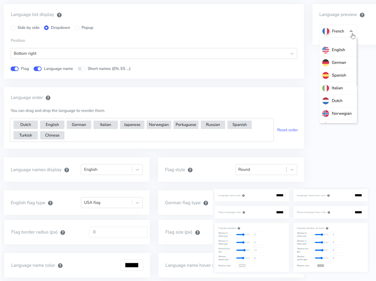
Different design styles for language switchers can shape how quickly users recognize the feature and whether they feel confident using it. Even small visual cues, such as using flags, text, or dropdowns—can significantly impact clarity, trust, and overall user satisfaction. Understanding these variations helps you choose a switcher style that feels natural for global audiences.
Flags vs. text
Using flags can seem intuitive at first because they are visually recognizable. Still, they often create confusion. A flag represents a country, not a language, which makes it inaccurate for multilingual countries or widely spoken languages. Users may also misinterpret which option applies to them when the flag does not match their cultural or linguistic identity.
Text-based switchers, like “English,” “Español,” or “Français,” offer far more clarity. They communicate the language directly, removing ambiguity and reducing the risk of misinterpretation. This approach is more inclusive and helps international users feel seen and respected.
Locale codes
Locale codes (e.g., EN-US, EN-UK, FR-CA) add precision for sites that serve regional variations. They help users quickly distinguish between country-specific content versions, especially useful in e-commerce, legal, or regulatory contexts. This ensures the user selects the version that fits their local standards.
However, locale codes may feel too technical for general audiences. If overused, they can make the interface look complex or intimidating. They work best when paired with friendly text labels, such as “English (US)” instead of just “EN-US,” to keep the experience approachable.
Dropdown vs. inline
Dropdown switchers are clean and minimal, making them ideal for designs where space is limited. They allow you to list many language options without cluttering the interface. Users are generally familiar with dropdowns, so the interaction feels natural and predictable.
Inline switchers, such as placing languages side by side (“EN | ES | FR”), increase visibility and can speed up the user’s decision. Since the options are always visible, users can make their choices instantly without needing extra clicks. This approach works best when your site supports only a handful of languages.
Visual hierarchy
A language switcher should be noticeable yet not overwhelm the interface. A strong visual hierarchy—achieved through spacing, alignment, or subtle styling—helps guide users naturally to the switcher. When designed well, users intuitively recognize where to change the language without needing to search.
Poor visual hierarchy, such as burying the switcher among other elements, increases cognitive load. Users may miss it entirely or assume the site doesn’t support their language, leading to frustration or abandoned sessions. Clear hierarchy ensures accessibility and supports smooth global navigation.
Size & contrast
The size of the switcher plays a major role in visibility. If it’s too small, users may overlook it, especially on mobile screens. A slightly larger touch target also improves usability for individuals with motor challenges or those who need to navigate quickly.
Contrast helps users spot the switcher instantly. A well-contrasted design—where the switcher stands out from the background—improves accessibility for all users, including those with visual impairments. Balanced contrast ensures the element is noticeable without disrupting the overall design harmony.
A/B test results and conversion insights

A/B testing helps you understand which elements truly influence user decisions when choosing a language. By comparing two different versions, you get real data about user behavior—not just assumptions. This makes it easier to determine the most effective strategy for improving engagement and conversions on a multilingual site.
Placement experiments
Placement experiments typically compare the location of the language switcher—such as the top-right header, the main navigation bar, or the footer. Each position creates a different user experience. When the switcher is placed in an obvious area, such as the header, users tend to find the language options faster, reducing friction during browsing.
In many cases, higher positions in the page hierarchy lead to more interactions. Users naturally scan the upper part of the page first when they land on a site. However, behavior varies between audiences, so A/B testing is essential to understand what works best for your specific visitors.
Results often highlight metrics such as click-through rates (CTR), the time needed to locate the switcher, and its impact on the bounce rate. When the placement is optimal, users feel more “supported,” stay longer, and are more likely to convert.
Design experiments
Design experiments focus on the visual appearance of the language switcher, such as using flags vs. text, choosing between dropdowns or inline buttons, or adjusting color and size. Clear and intuitive design helps users instantly recognize the purpose of the switcher, minimizing confusion.
In many A/B tests, simpler and more consistent designs tend to perform better. For example, text labels displaying full language names (such as “English” and “Indonesian”) can be more effective than flag icons, which are not always universally understood. Minimalist designs also help the switcher blend smoothly into the UI without distracting from other important elements.
Insights from these experiments often reveal that even small adjustments—like increasing click area, improving color contrast, or reducing steps to switch languages—can significantly boost interaction. When the design feels effortless and intuitive, users transition between languages more smoothly, increasing the likelihood of conversion.
Recommended UX best practices

UX best practices help ensure that your language switcher performs well for all users—visually, functionally, and even in terms of SEO. By following the right principles, you can create a consistent and intuitive experience across your entire site.
Desktop & mobile placement
Language switcher placement often differs between desktop and mobile because user interaction patterns change depending on the device. On a desktop, the top-right header area is usually the best location because it is easy to spot and doesn’t interfere with other navigation elements. Desktop users naturally scan this area first, enabling them to quickly find the language option without requiring extra cognitive effort.
On mobile, limited screen space requires a more strategic approach. Many sites place the switcher inside the hamburger menu to keep the interface clean, but it’s important not to hide it too deeply. Ideally, the language option should appear at the top of the menu or as a persistent element in the header, so it remains easily accessible. This ensures the experience stays quick and intuitive on smaller screens.
Accessibility & usability
Accessibility is essential because the language switcher should be usable by everyone, including users with disabilities. Make sure the switcher is readable by screen readers, has clear labels, and can be navigated using a keyboard. Accessible design not only supports international standards but also broadens your audience reach.
From a usability standpoint, the switcher should provide clear visual feedback, such as hover highlights or color changes when selected. Responsive interaction helps users feel confident that their language choice has been applied correctly. Combining accessibility and usability creates a smoother, more inclusive experience for all visitors.
In addition to accessibility, offering customization options allows users and site owners to tailor the language switcher to personal preferences, such as adjusting colors, icons, placement, or overall style. Tools like Linguise support this flexibility by providing fully customizable switcher designs, ensuring the final appearance fits both brand identity and user comfort.
Localization & SEO impact
A well-structured language switcher also plays a crucial role in SEO for multilingual websites. Each language should have its own dedicated URL, proper hreflang tags, and fully localized—not merely translated—content. These elements help search engines understand which language version to serve to users in different regions.
From the user’s perspective, a clearly presented switcher makes it easier to find content in their preferred language, which increases session duration and reduces bounce rates. Both factors send strong positive signals to search engines. By combining solid UX with proper SEO practices, your multilingual website becomes not only easier to use but also more competitive in global search results.
Linguise can support this process by automatically generating SEO-friendly translations, managing hreflang tags, and providing customizable language switcher designs. This ensures your multilingual setup stays consistent, optimized, and easy for users to navigate—without requiring manual setup for every language.
Conclusion
A well-designed language switcher plays a critical role in creating a smooth, intuitive, and conversion-friendly multilingual experience. By optimizing placement, design clarity, accessibility, and localized SEO structure, your website becomes easier to navigate for global visitors—ultimately improving engagement, trust, and overall user satisfaction. Strong UX decisions, backed by A/B testing insights, ensure that every element supports your multilingual strategy effectively.
If you want to streamline this entire process with accurate machine translation, automatic localization, and an SEO-friendly multilingual setup, Linguise offers an AI-powered solution that saves time while maintaining quality. Try Linguise to simplify your translation workflow and upgrade your multilingual website experience.